Raygil
Rebranding
Brief
Raygil set out to reposition itself as a brand of contemporary luxury through minimalism. The rebranding needed to honor the brand’s long history while creating a modern, emotionally engaging experience. The goal was to build a visual identity that feels deliberate and authentic, appealing to an audience that values quality, craftsmanship, and meaning.
The challenge: to develop a design that bridges tradition and modernity without becoming decorative or generic.
Solution
We created a visual identity that reinterprets Raygil’s core values.
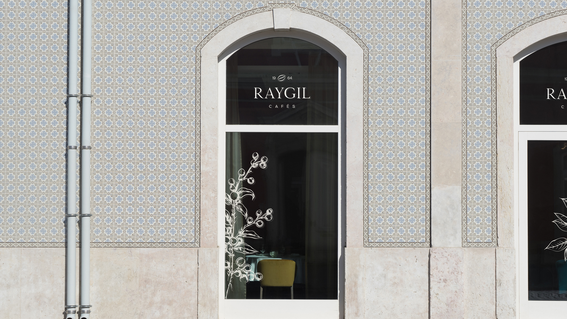
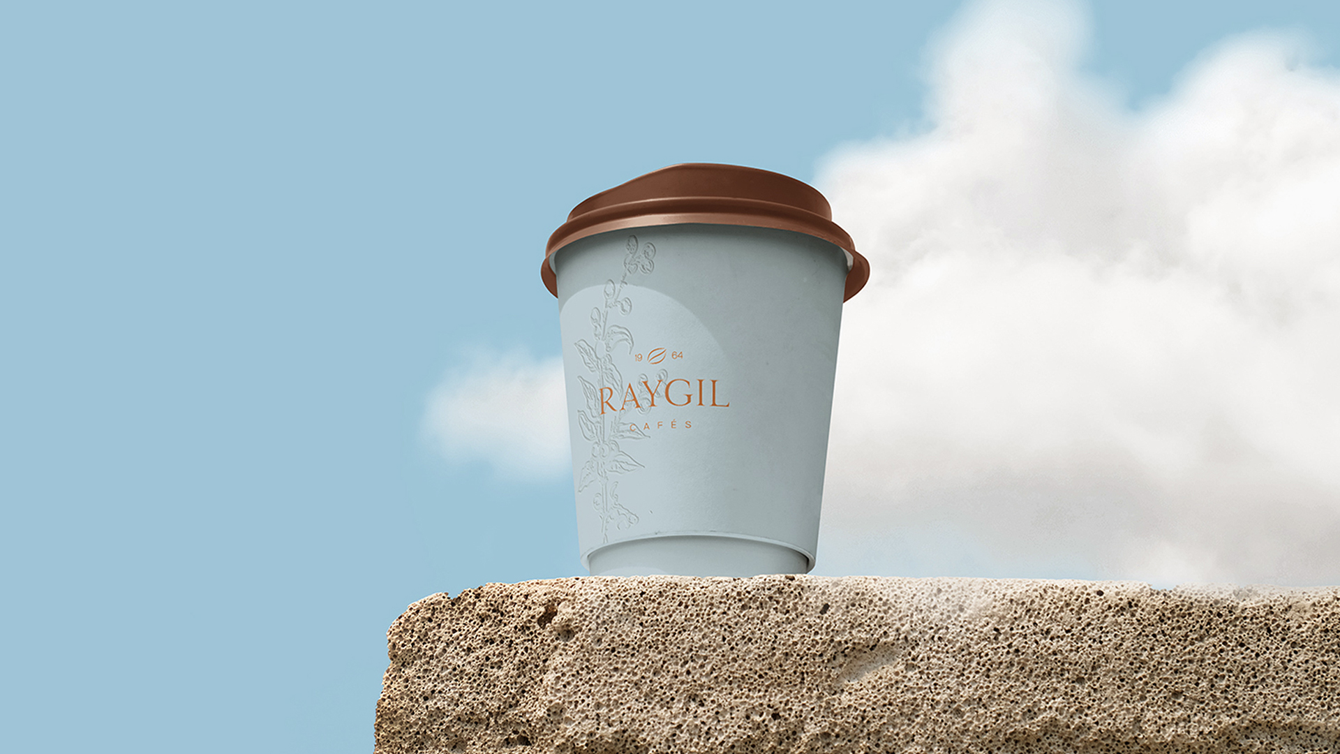
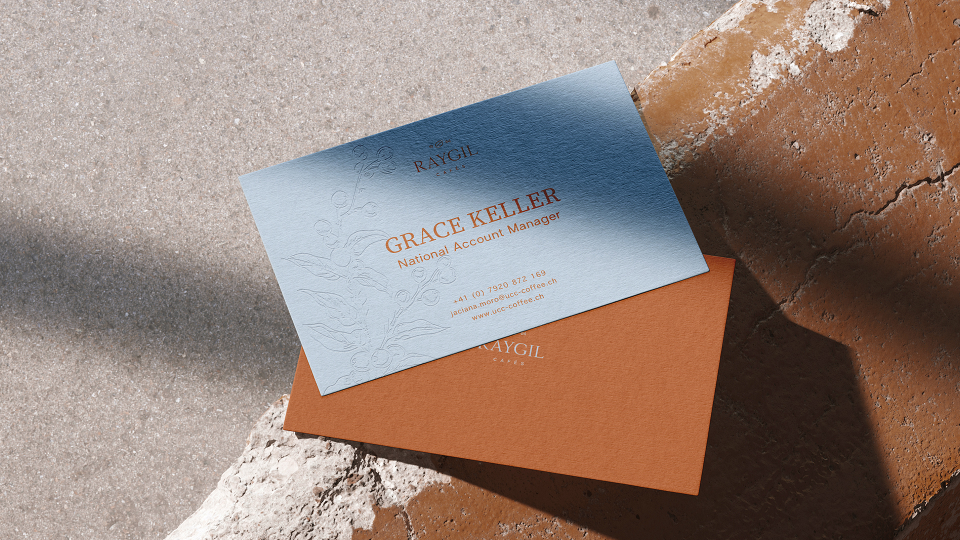
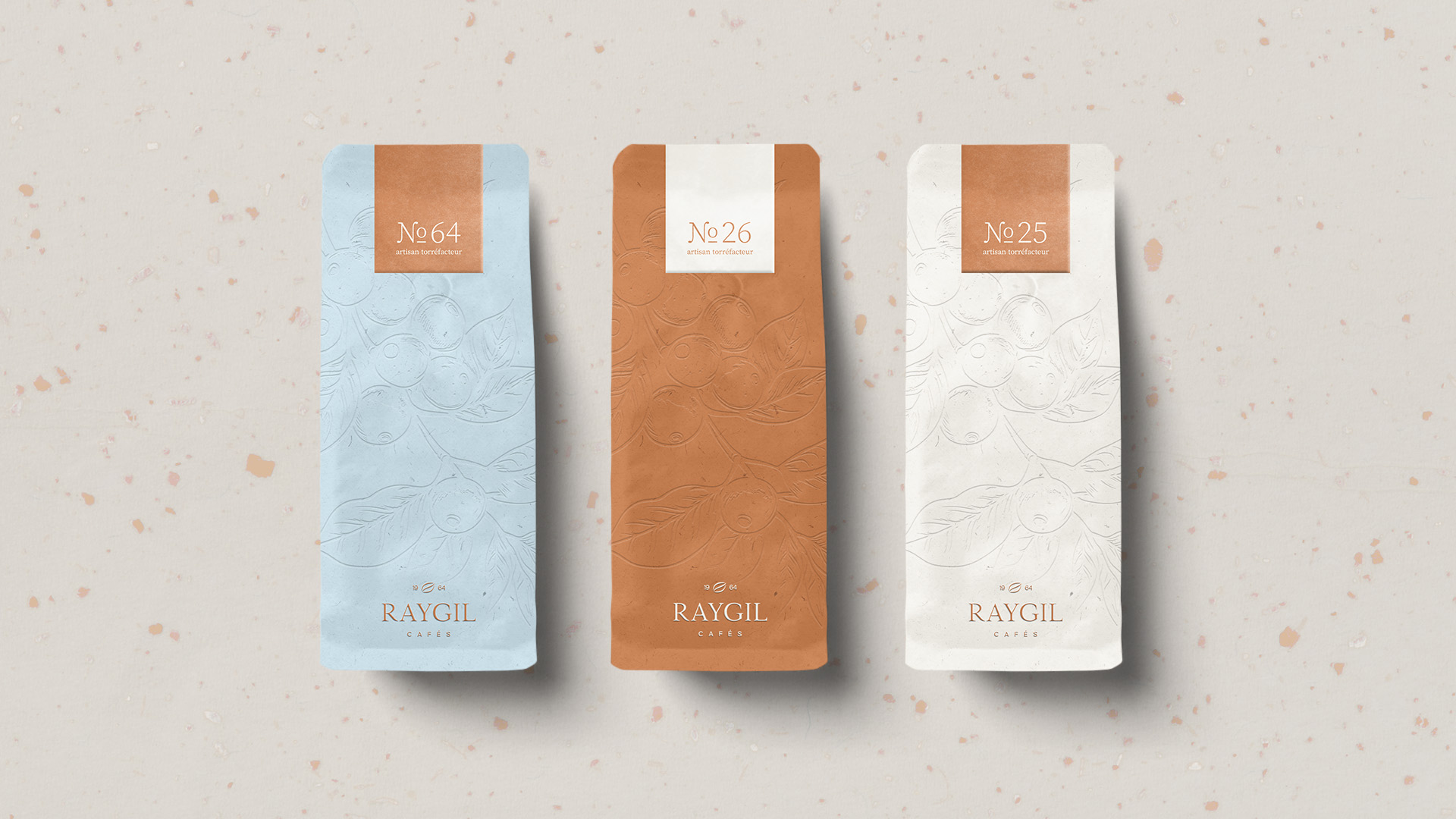
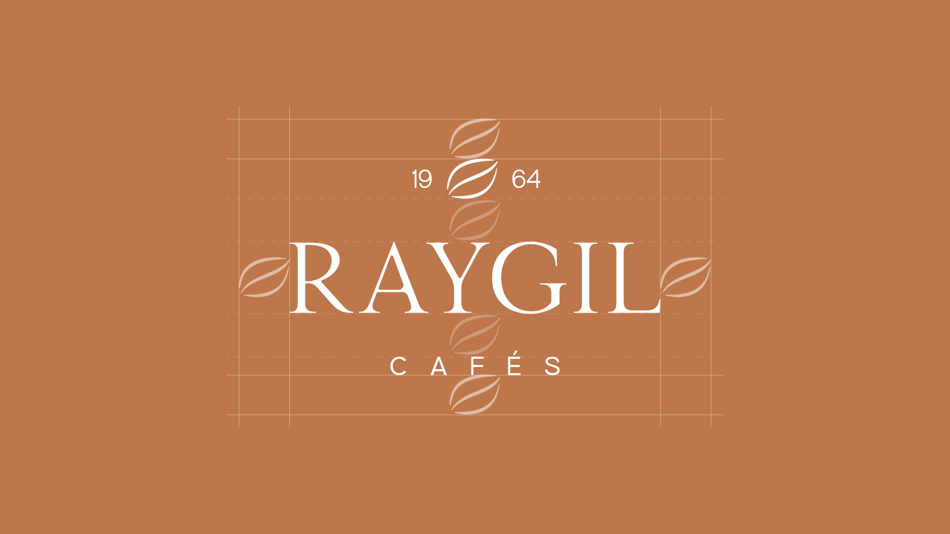
The logo uses a refined serif typeface with generous spacing. The addition of "Since 1964" highlights the brand’s heritage and builds trust.
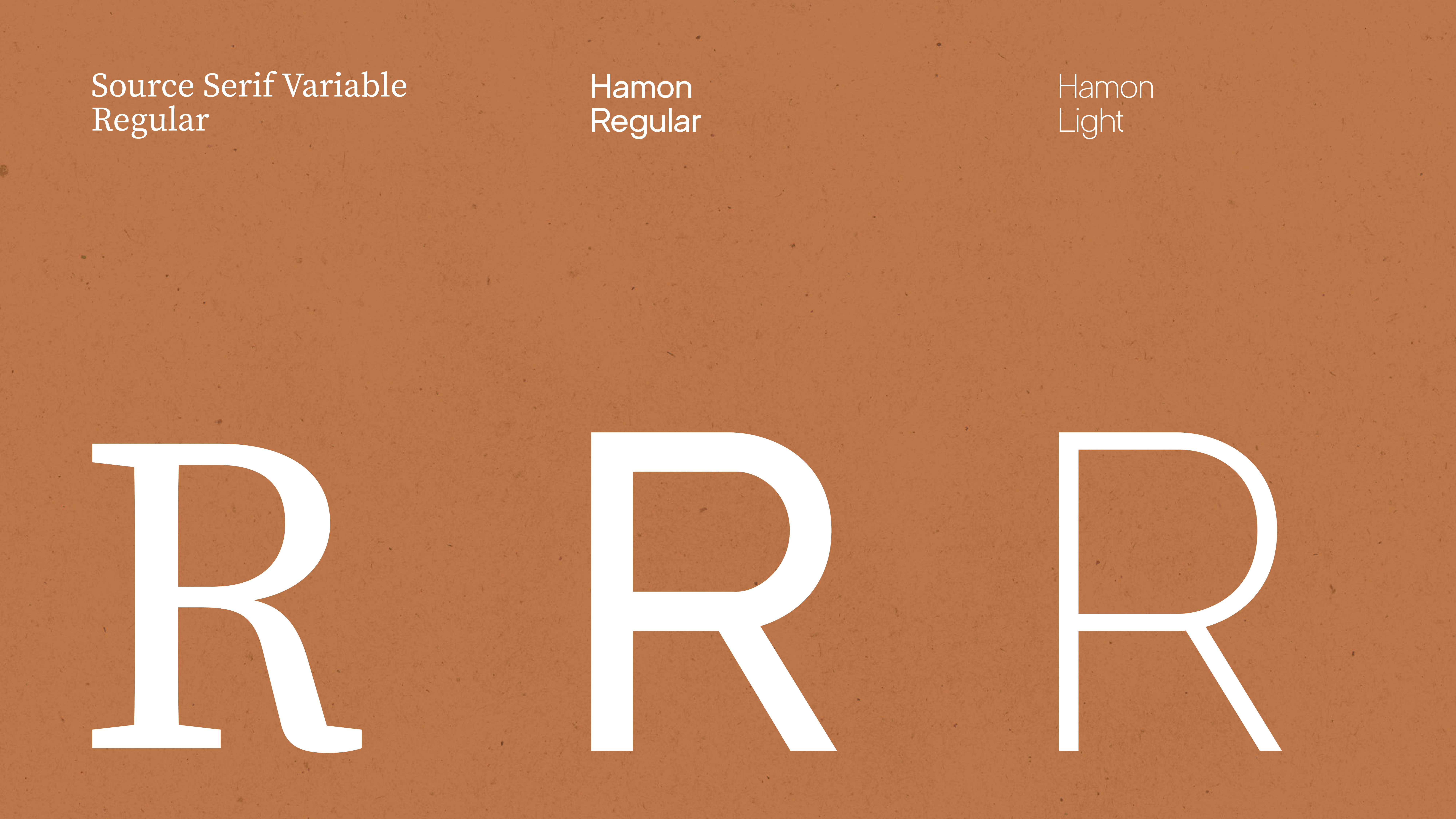
The typography system combines Source Serif Variable Regular for headlines and Hamon for body text, balancing classical style and modern clarity.
We created a visual identity that reinterprets Raygil’s core values.
The logo uses a refined serif typeface with generous spacing. The addition of "Since 1964" highlights the brand’s heritage and builds trust.
The typography system combines Source Serif Variable Regular for headlines and Hamon for body text, balancing classical style and modern clarity.
Solution
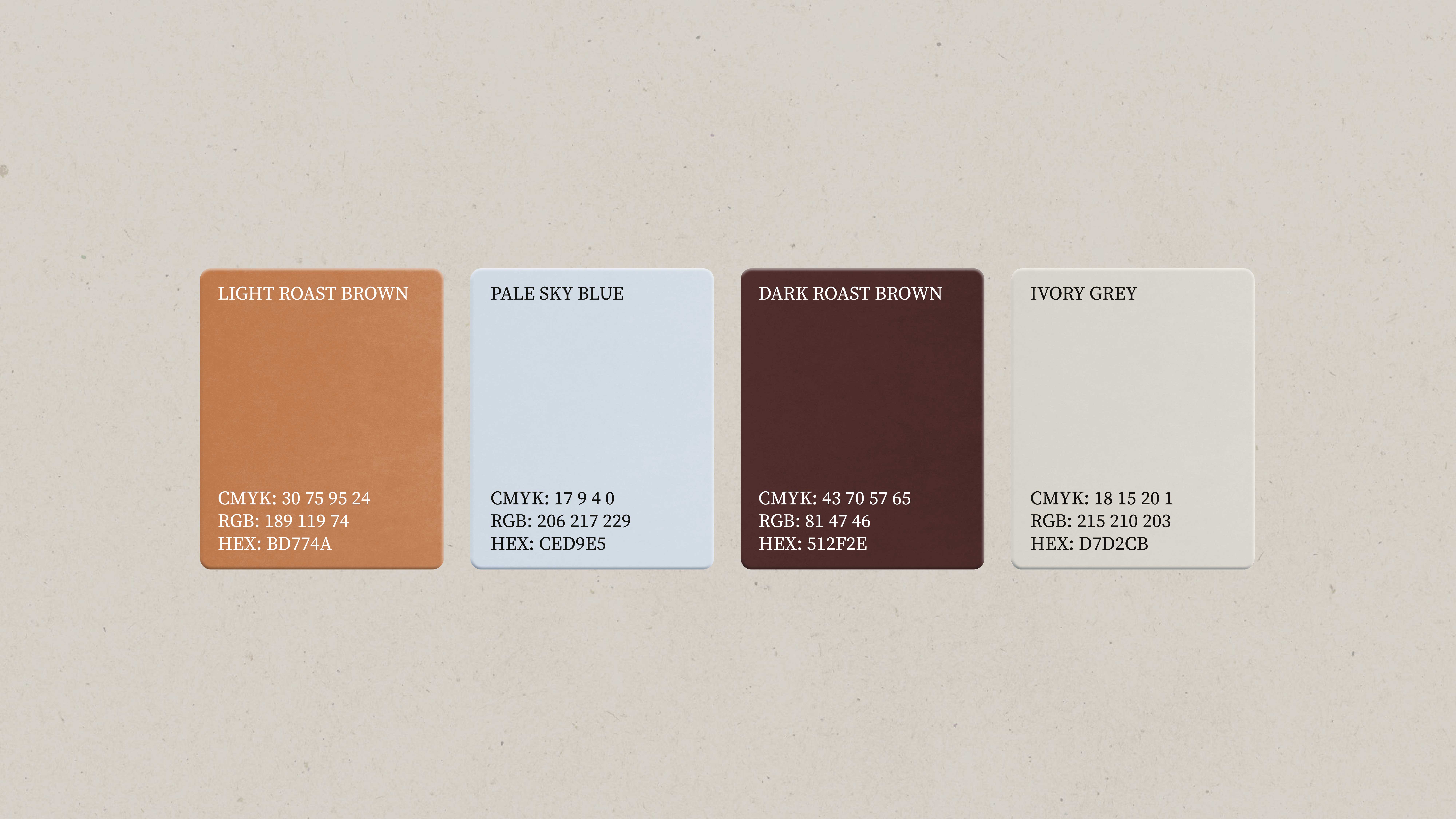
The color palette relies on natural tones: earthy browns and beiges, complemented by a soft light blue as a subtle accent.
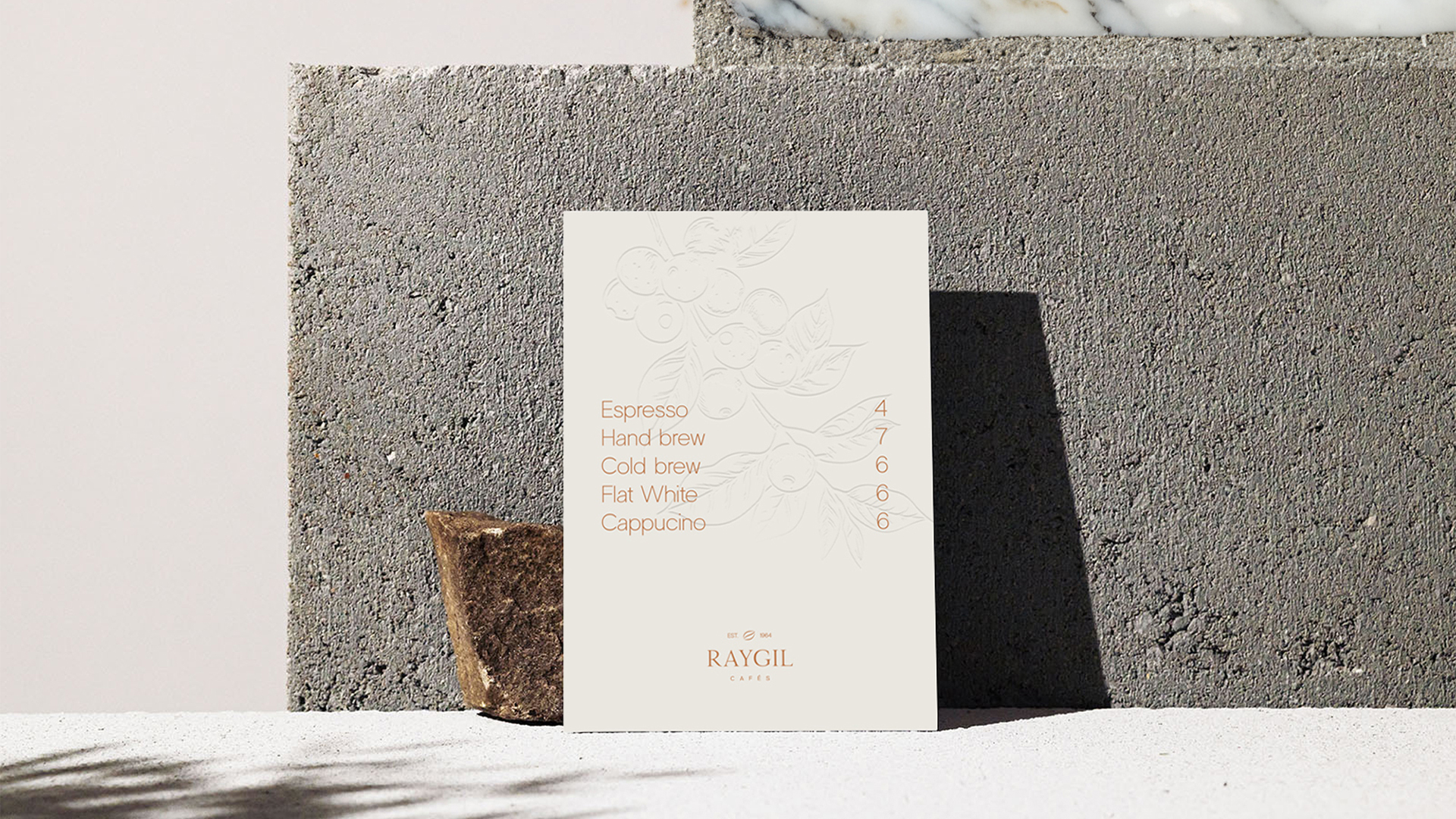
A minimalist coffee branch illustration supports the brand language, emphasizing craftsmanship without being overt.
Raygil now presents itself as a brand defined by deliberate simplicity—for individuals who appreciate authenticity, quality, and understated style.
The color palette relies on natural tones: earthy browns and beiges, complemented by a soft light blue as a subtle accent.
A minimalist coffee branch illustration supports the brand language, emphasizing craftsmanship without being overt.
Raygil now presents itself as a brand defined by deliberate simplicity—for individuals who appreciate authenticity, quality, and understated style.