Giger Kafi
Rebranding
Brief
GIGER KAFI, a traditional Bernese coffee brand, wanted to renew its brand identity - with the aim of preserving its origins while creating a fresh, clearer expression.
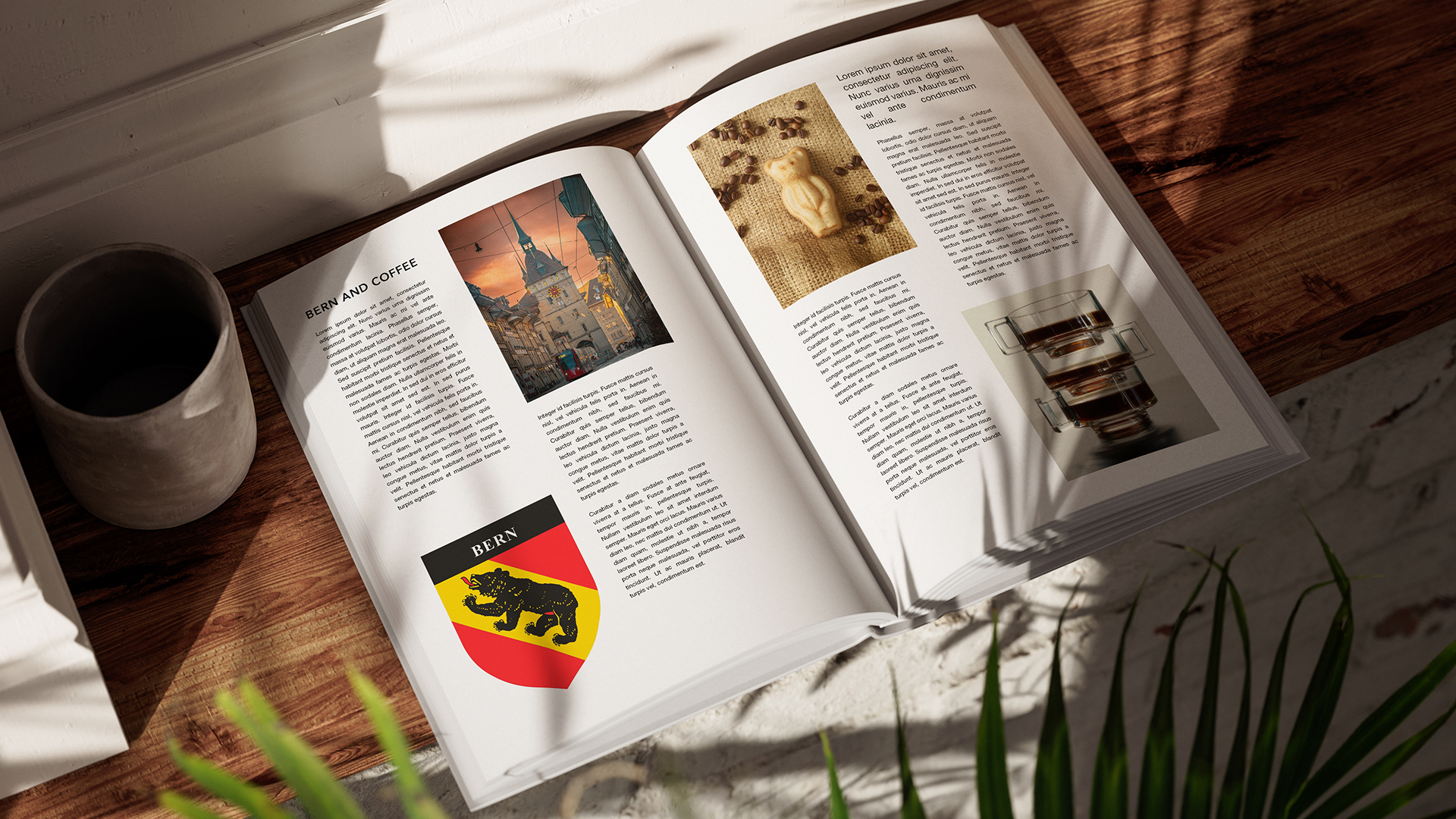
The focus was on the Bernese bear - firmly anchored in the regional identity. The challenge: to interpret this symbol in a modern way without losing its recognition value. The new brand world should continue to stand for tradition and at the same time appeal to new customers.
GIGER KAFI, a traditional Bernese coffee brand, wanted to renew its brand identity - with the aim of preserving its origins while creating a fresh, clearer expression.
The focus was on the Bernese bear - firmly anchored in the regional identity. The challenge: to interpret this symbol in a modern way without losing its recognition value. The new brand world should continue to stand for tradition and at the same time appeal to new customers.
Solution
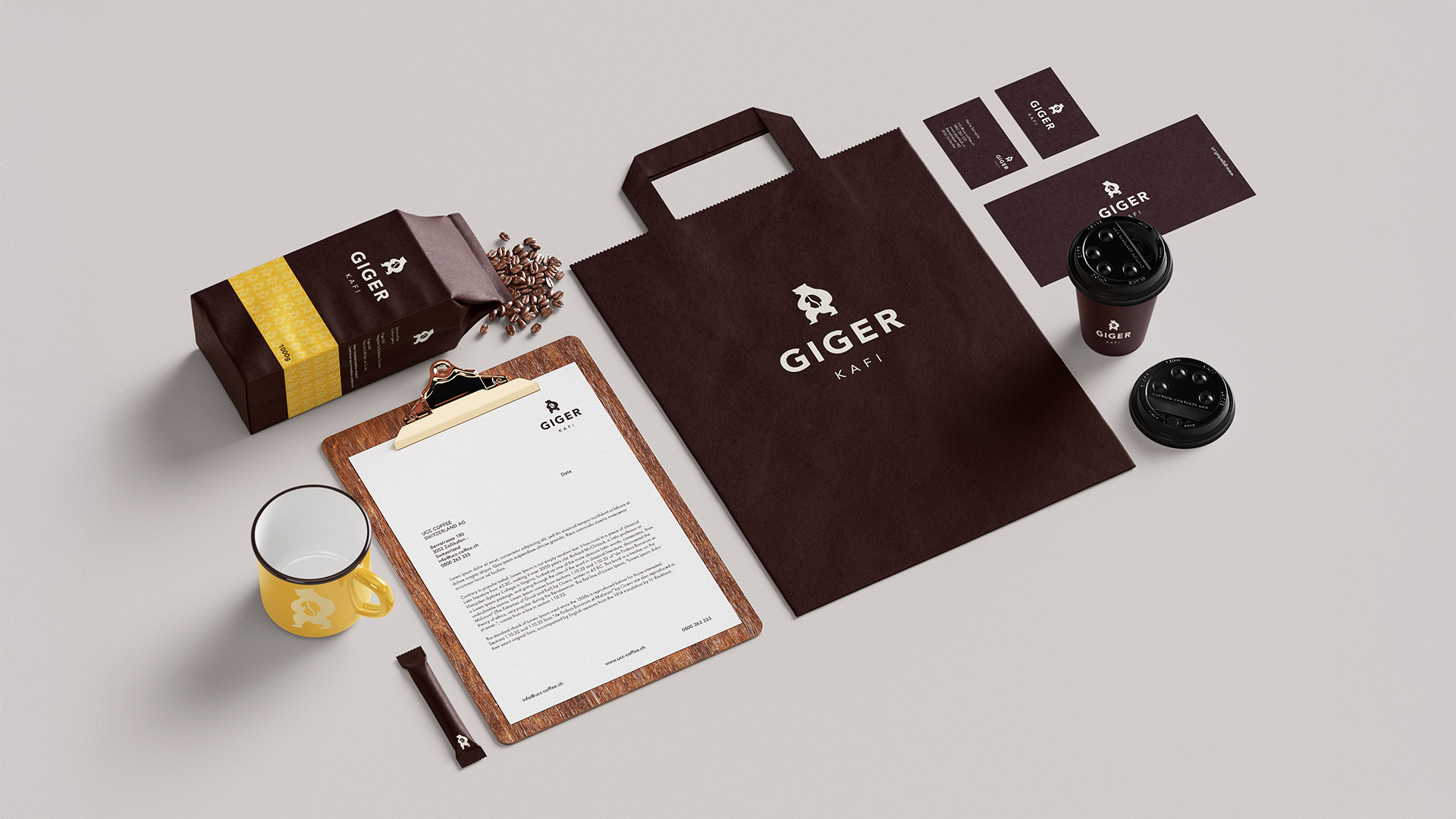
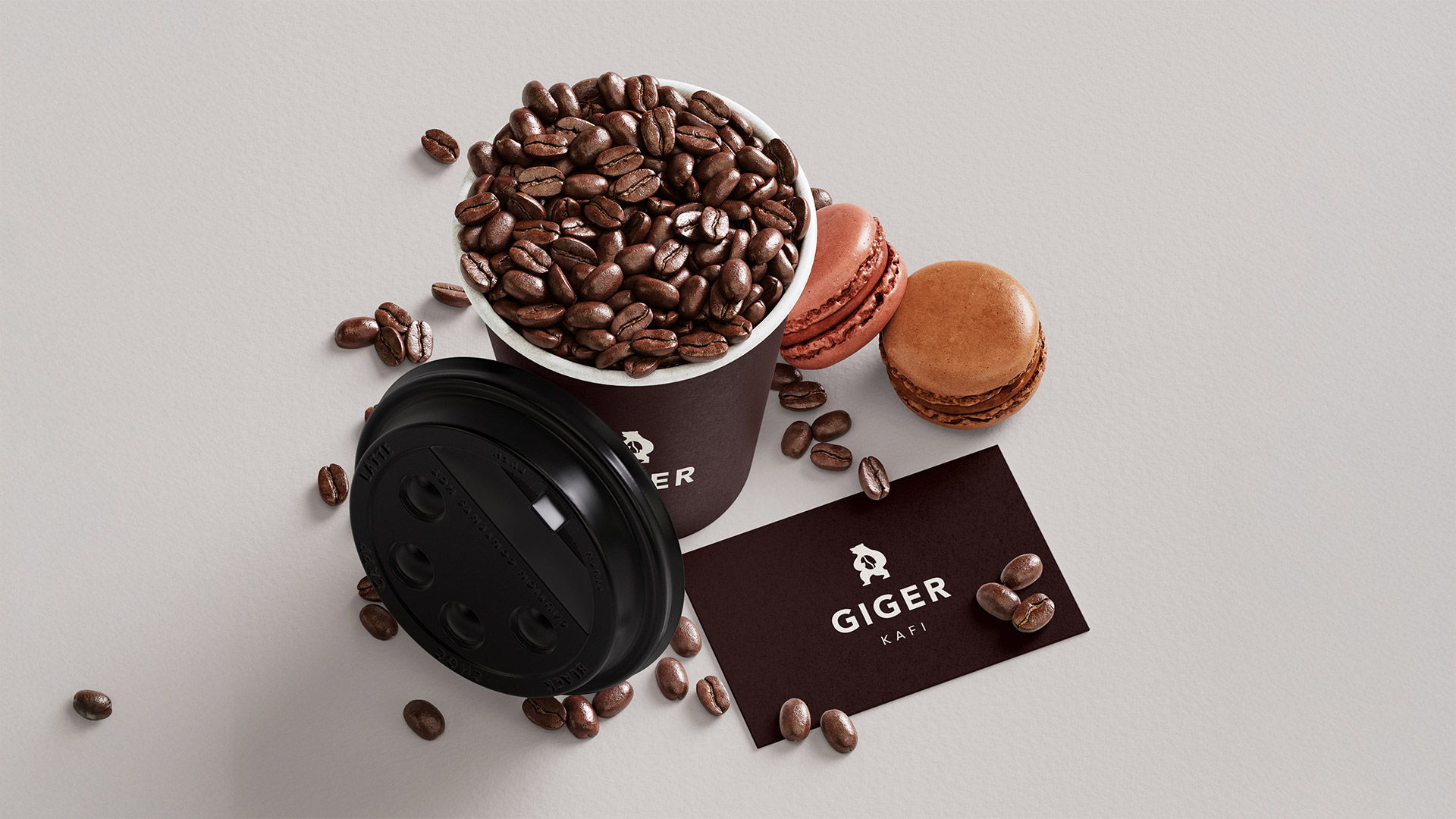
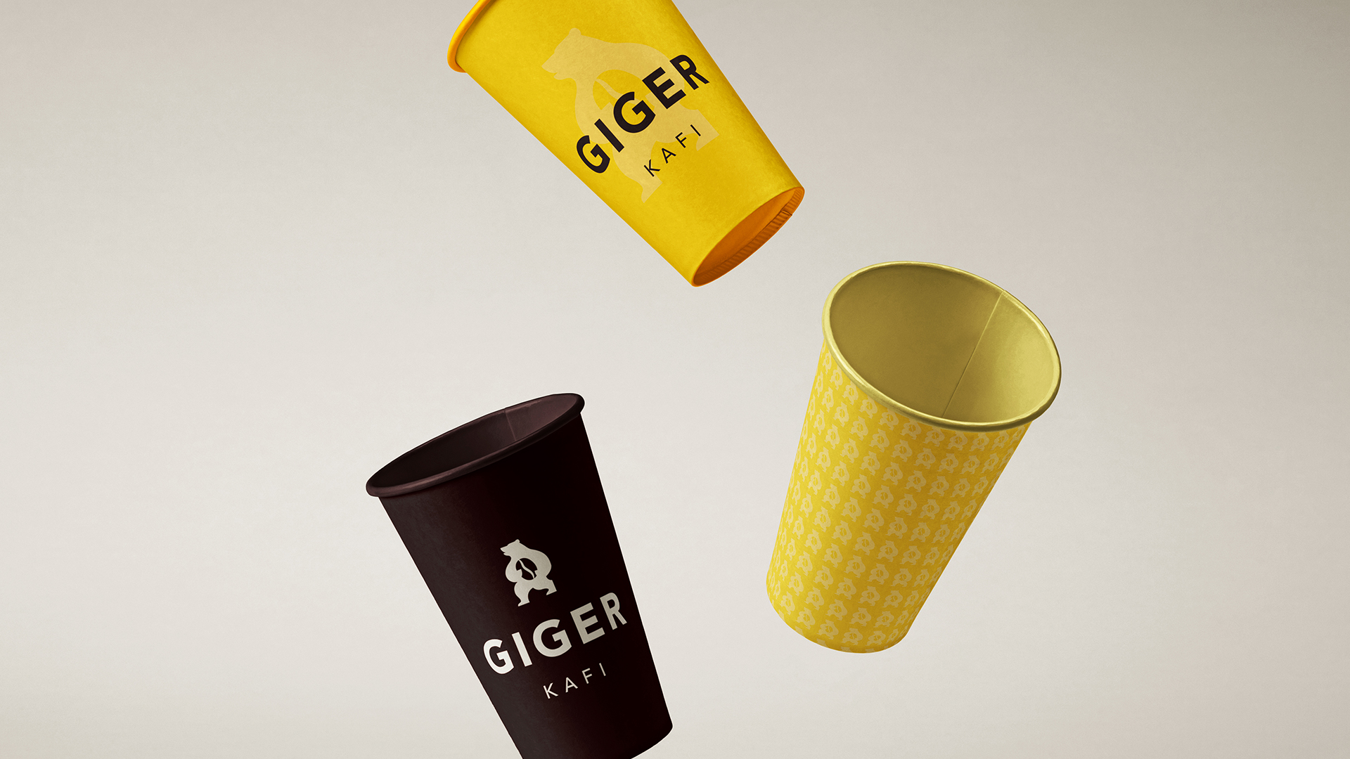
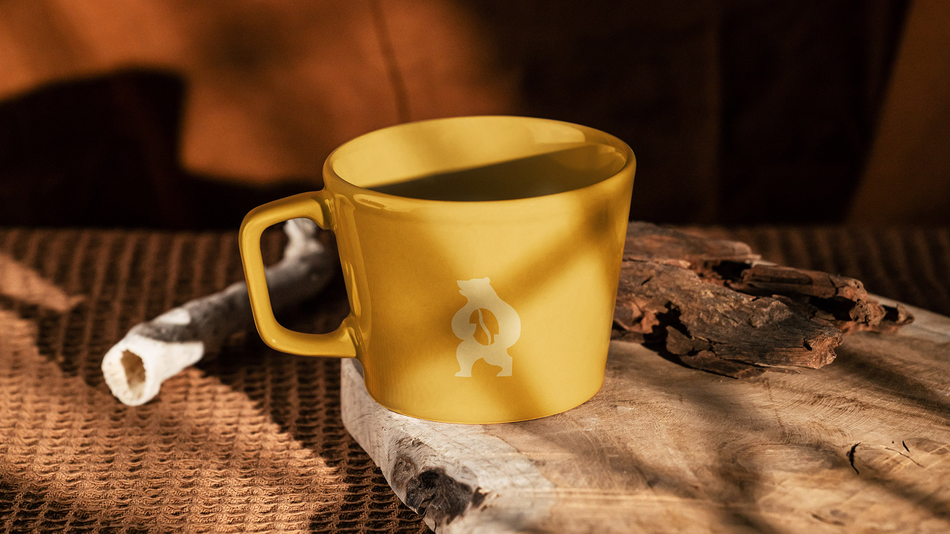
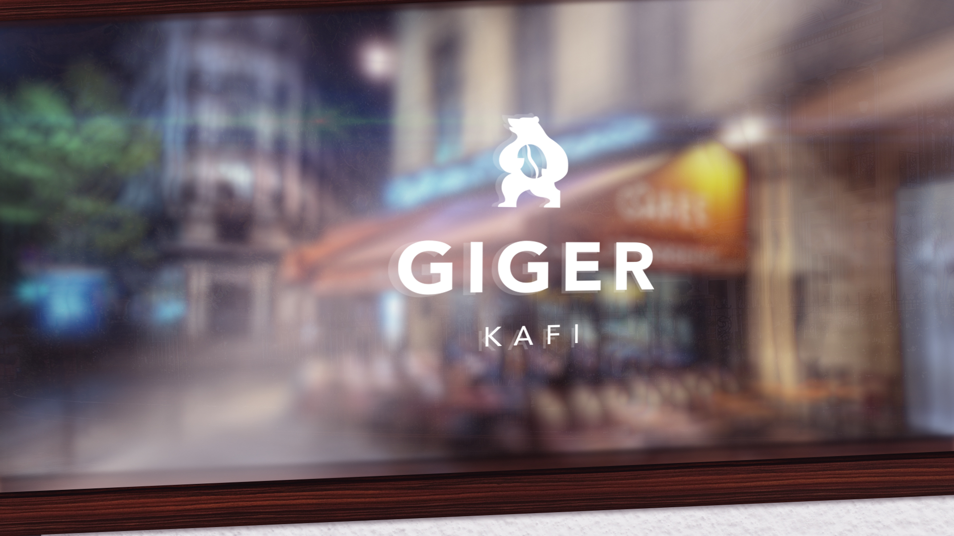
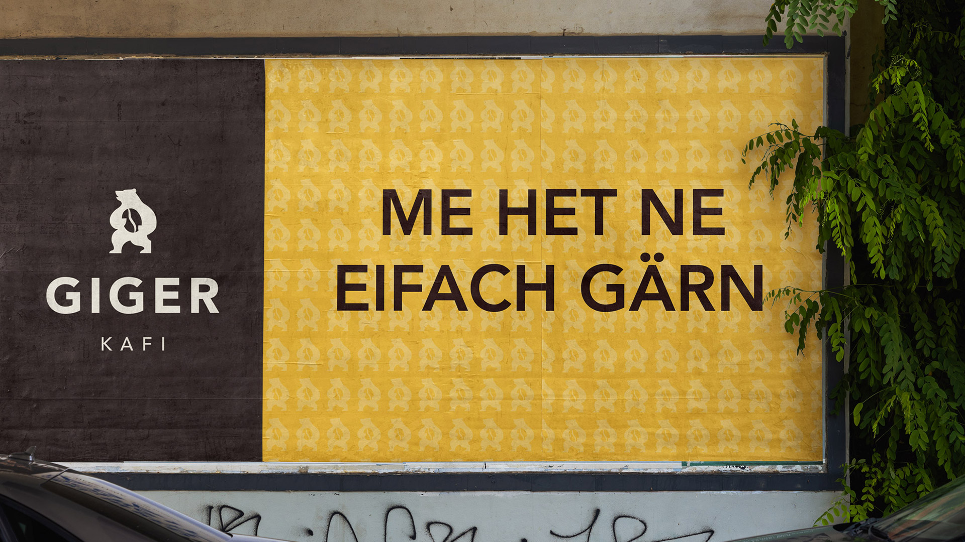
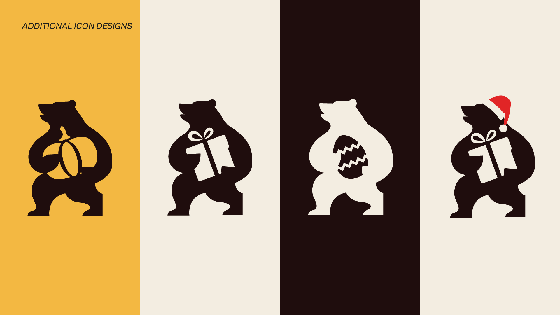
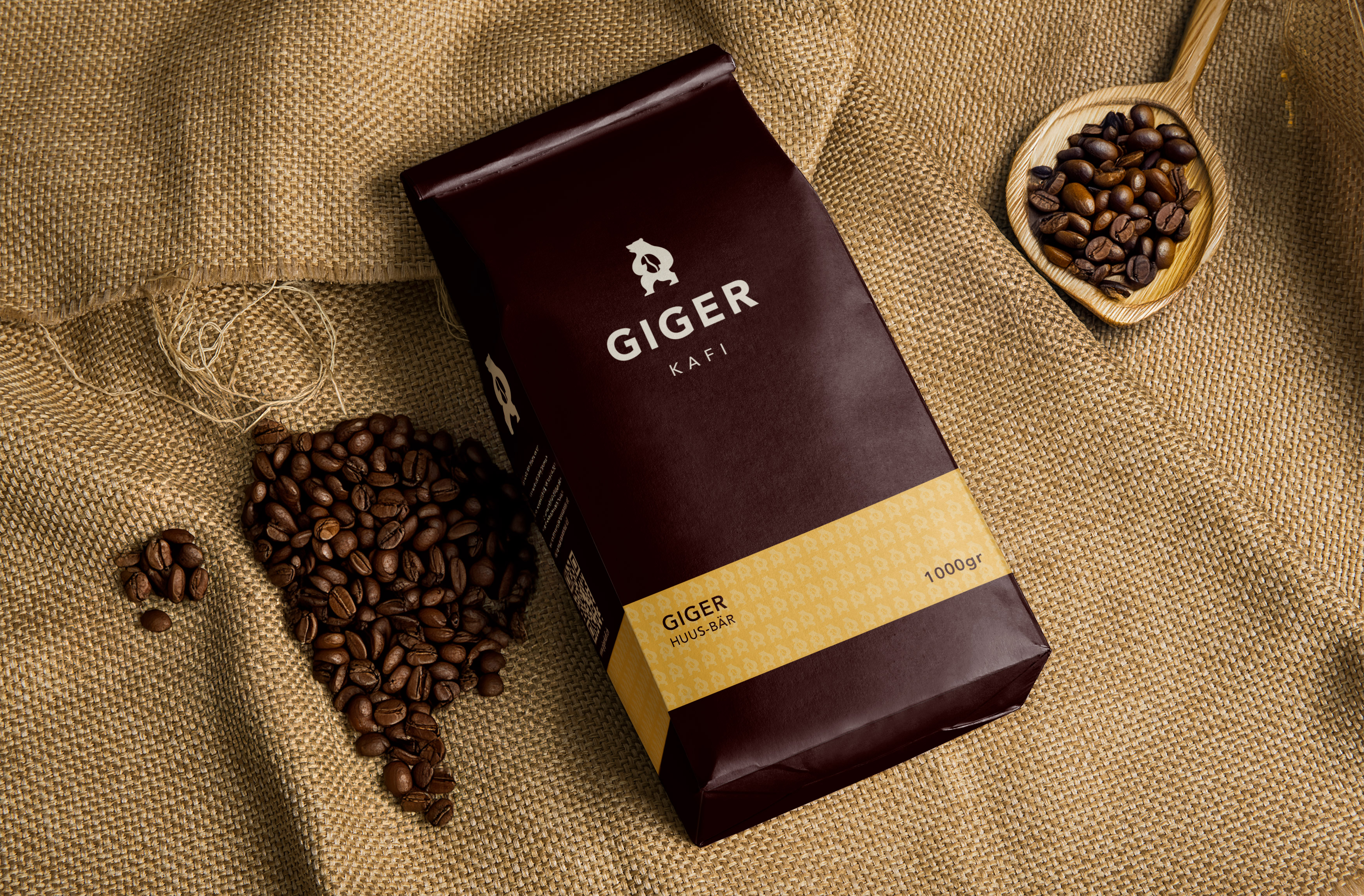
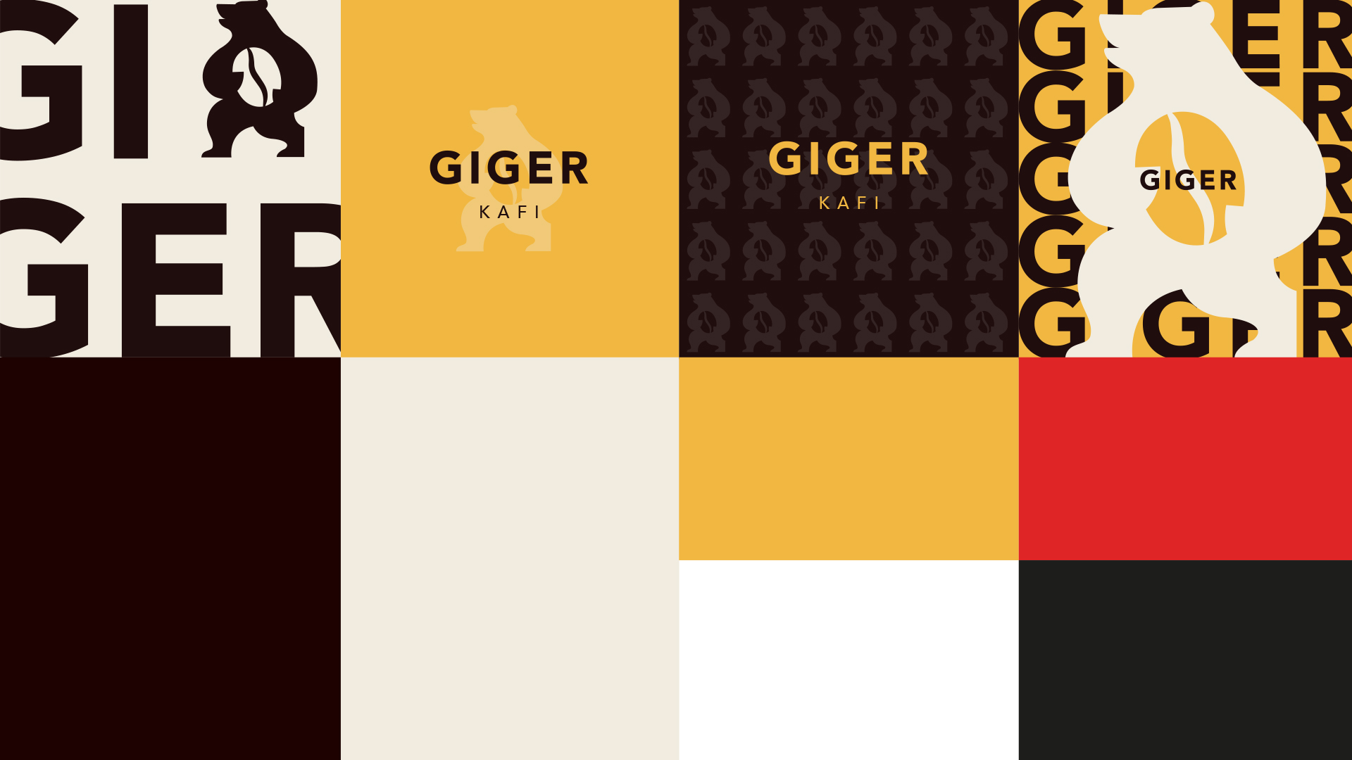
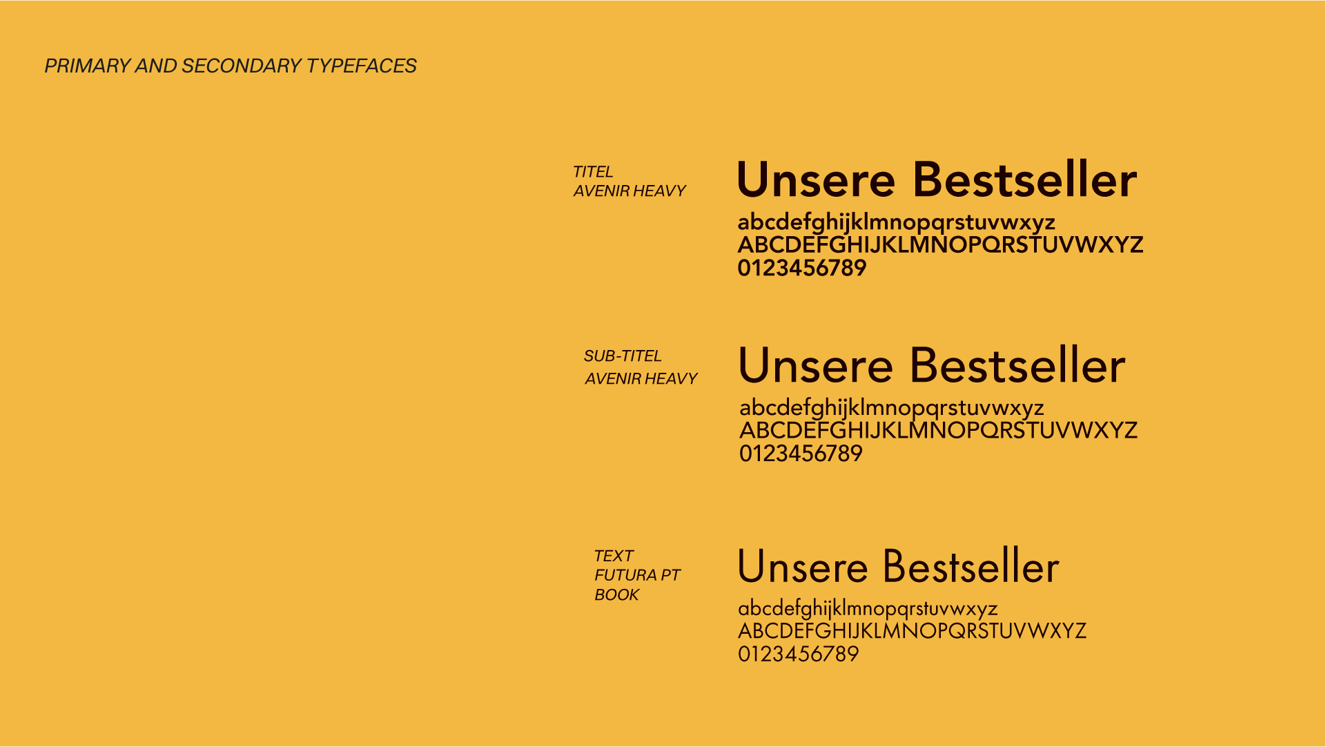
We rethought the iconic bear - clearer, more concise and with a stronger connection to the product world. The original box in its paw has been replaced by a stylized coffee bean - a small but expressive detail that emphasizes craftsmanship and origin. The visual language combines reduction with character. The color scheme - an interplay of deep brown, soft cream and yellow accents - builds a bridge between coffee enjoyment and echoes of the Bernese flag. The Bauhaus typography brings structure and Swiss clarity to the design.
The result: an identity that remains rooted in Bernese culture and yet takes a step forward in terms of design.