SWISSPER
"Where Social Meets Media" Rebranding
Brief
SWISSPER, one of Switzerland's leading social and media agencies, was undergoing a transformation: strong growth, new services and an expanded self-image as a creative force in the digital space.
Our task was to translate this development into a contemporary, expressive rebranding - a visual identity that reflects the character of the brand and is convincing in terms of both strategy and design.
Solution
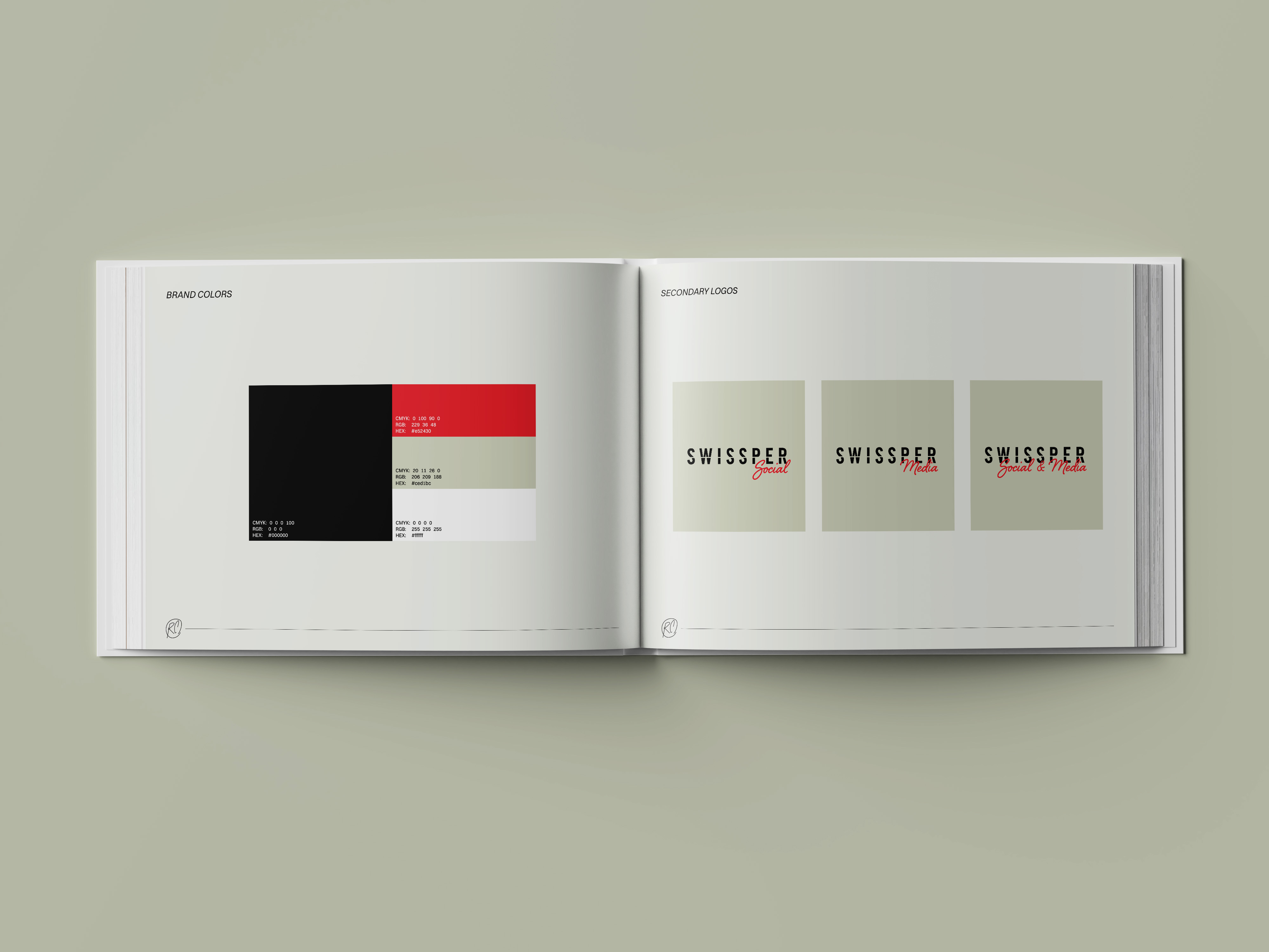
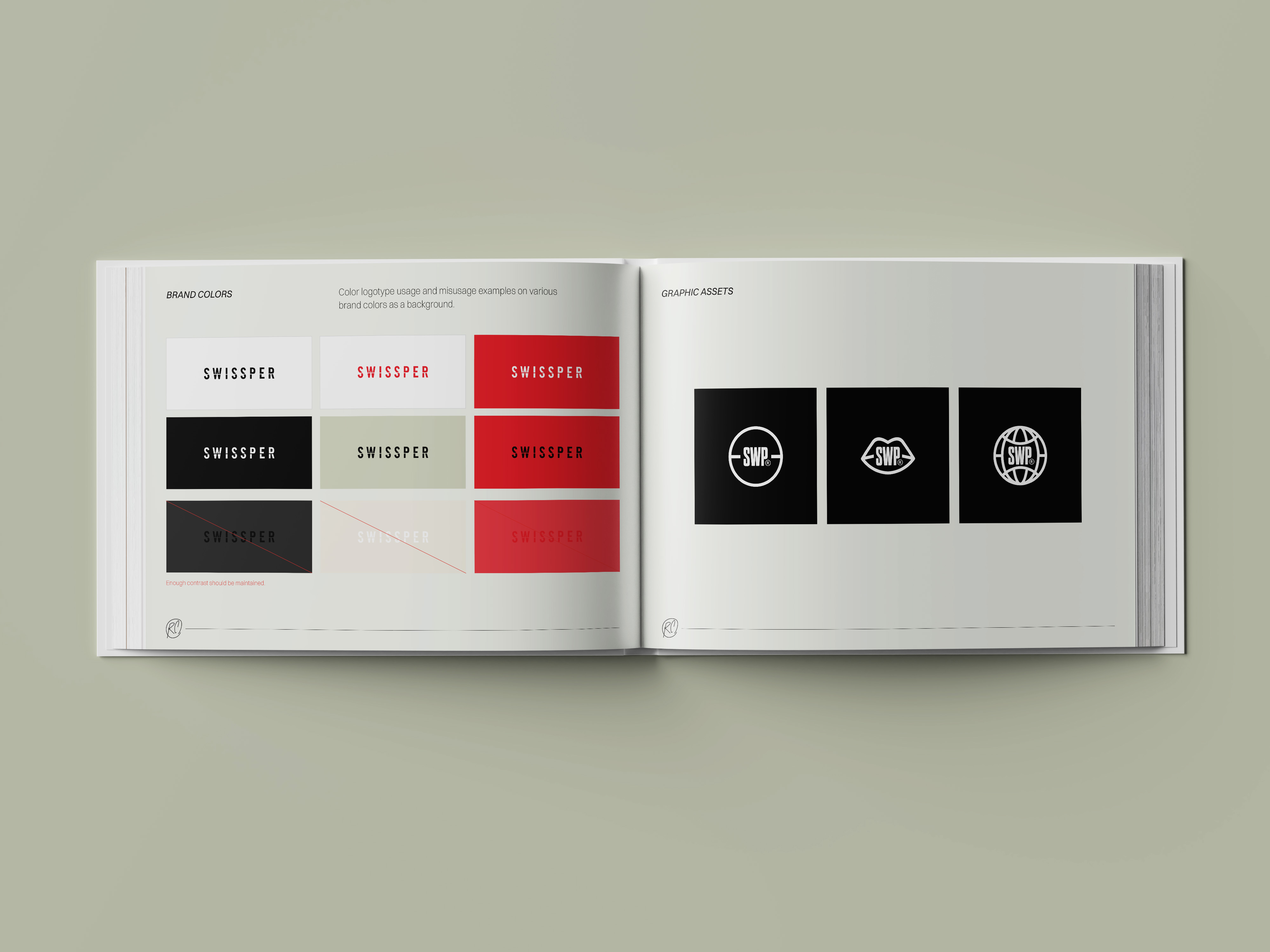
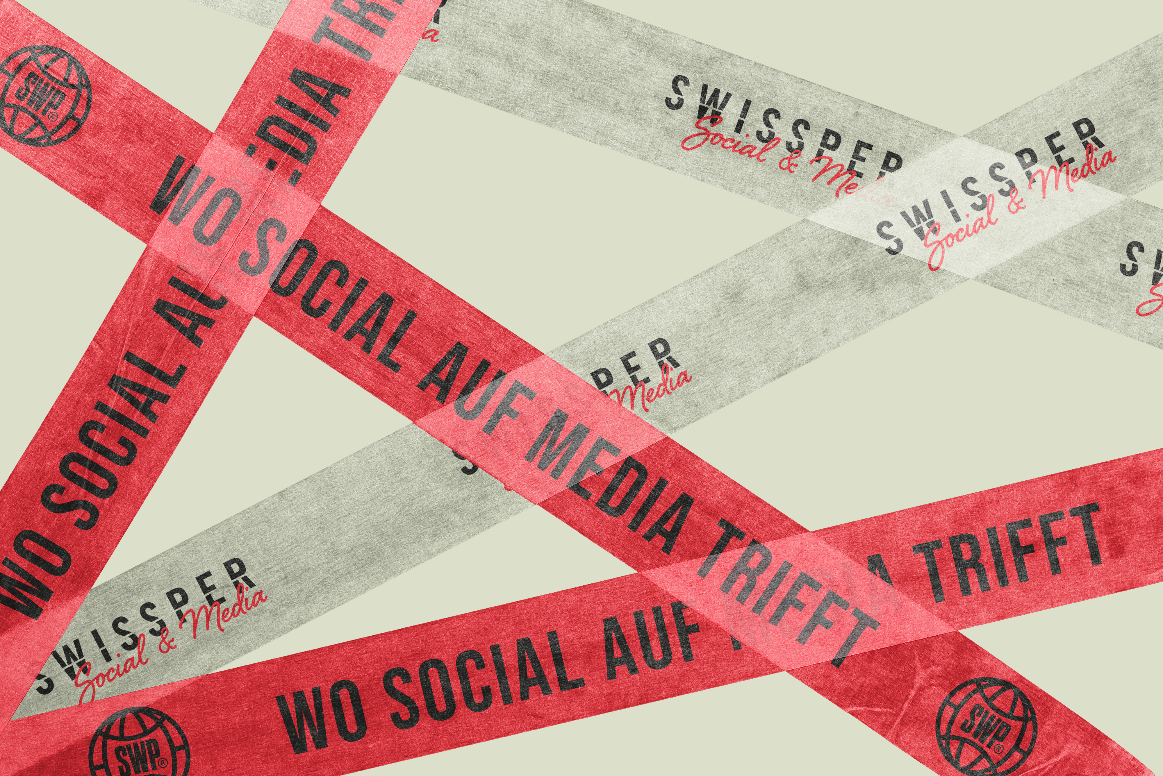
For the rebranding of SWISSPER, we developed a clear, bold visual identity that offers both recognizability and fresh relevance. The striking red - as a symbol of Swissness and central brand color - was retained, but modernized: stronger, brighter, more self-confident. It is complemented by a restrained sage green, which lends calm and balance to the new color scheme.
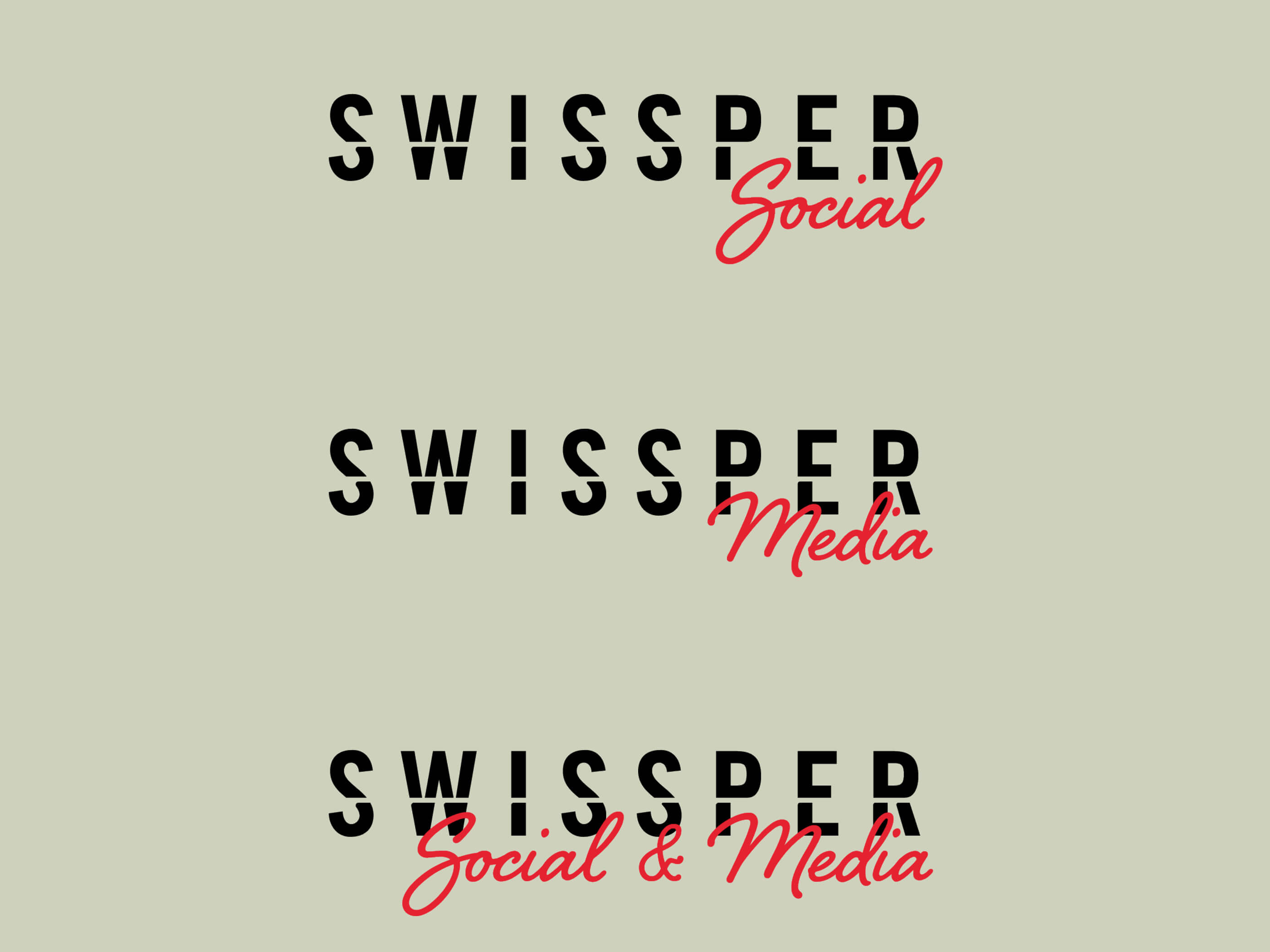
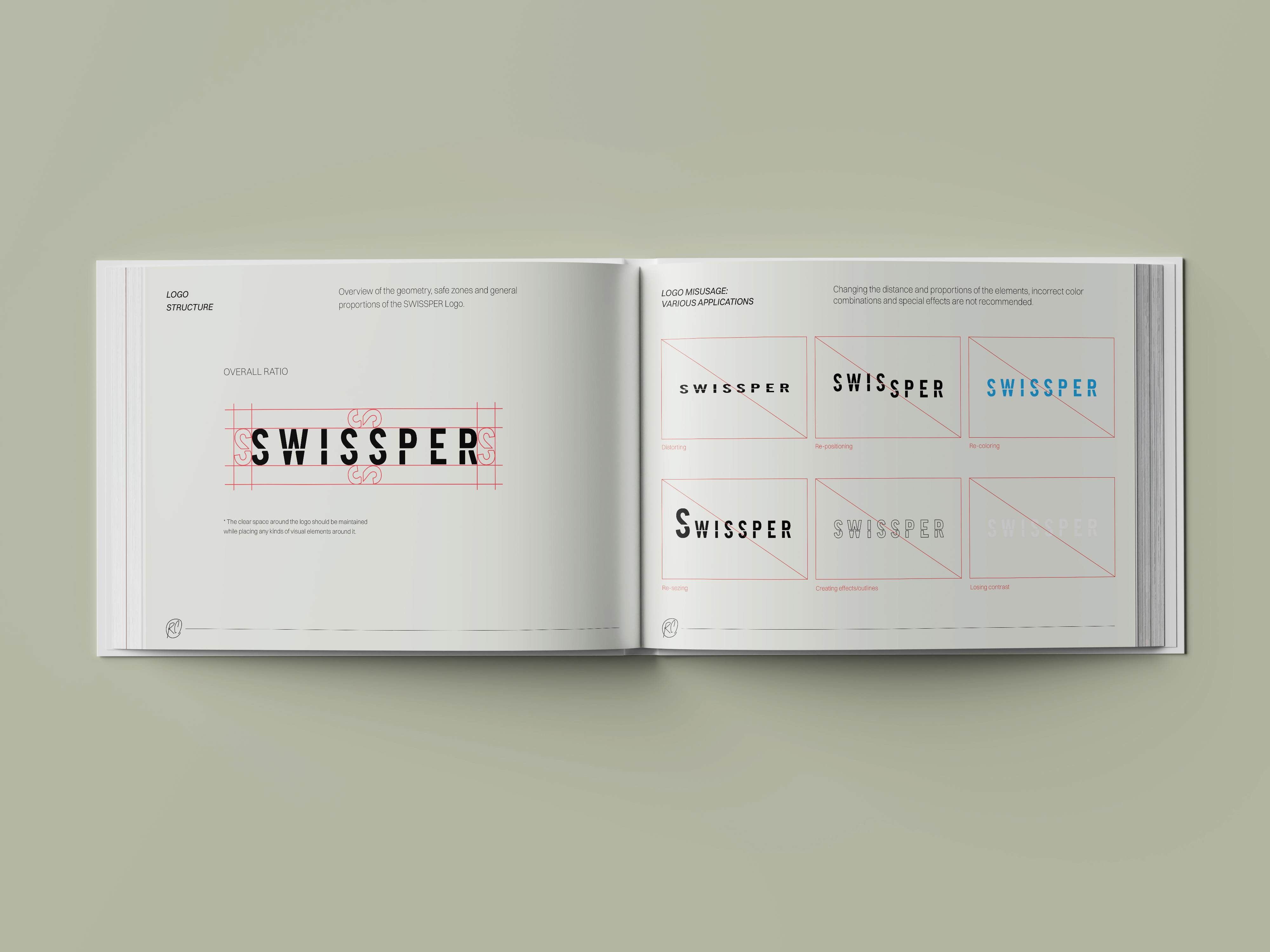
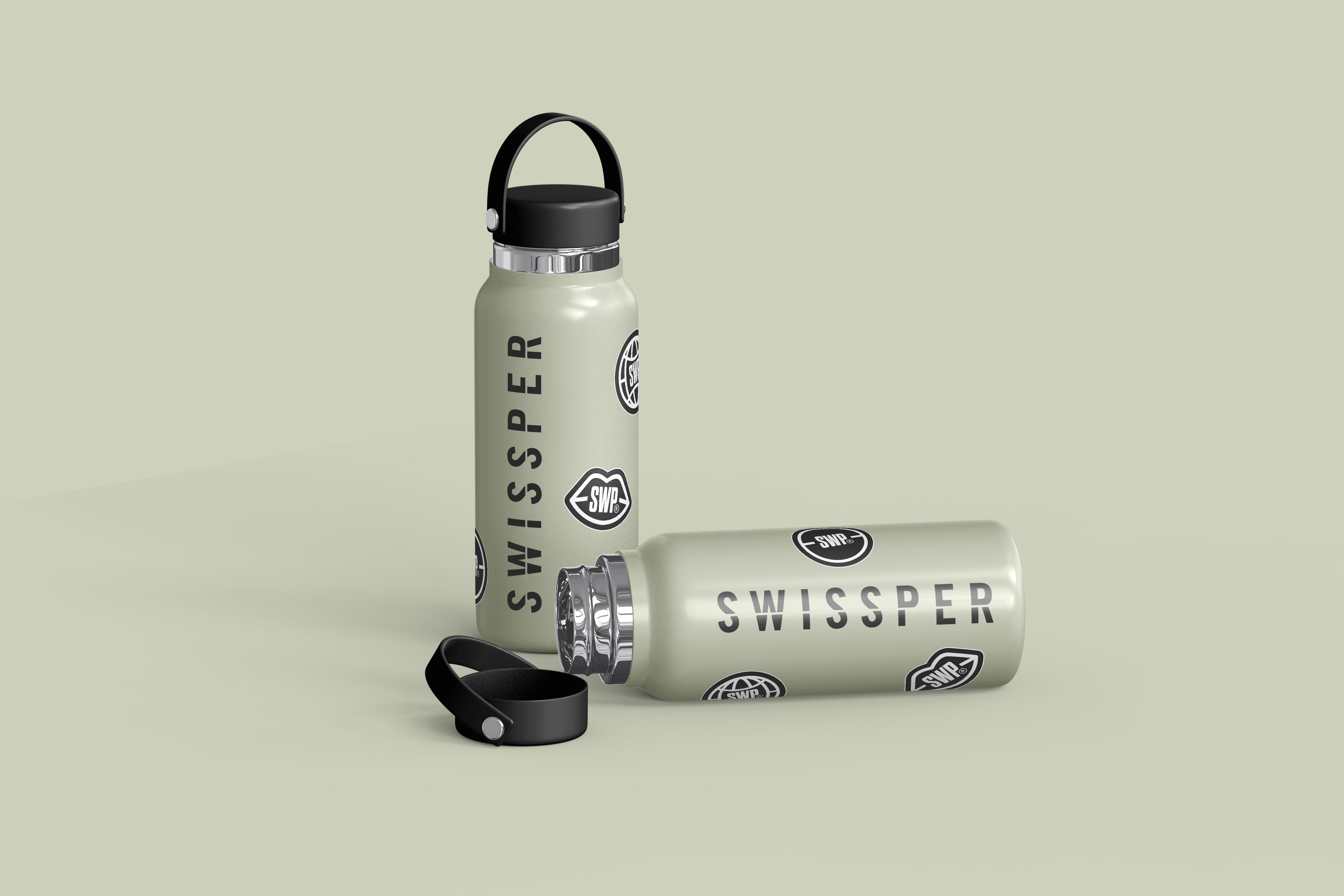
The revised logo relies on a modern, geometric sans serif - interrupted by a striking cut through the word mark. The “cut” symbolizes the cinematic cut and refers to SWISSPER's role as a social and media agency that stages brands via influencer and own content. A complementary script font in red brings back the handwriting of the old brand - now more modern and reduced. The logo has a modular structure and can be flexibly combined with the additional designations “Social”, ‘Media’ or “Social & Media”. We also developed three characteristic icons that visually reflect the brand essence: a lip (testimonial), a globe (diversity) and a camera focus (staging). All icons bear the reduced brand abbreviation SWP and can be used in a variety of ways.
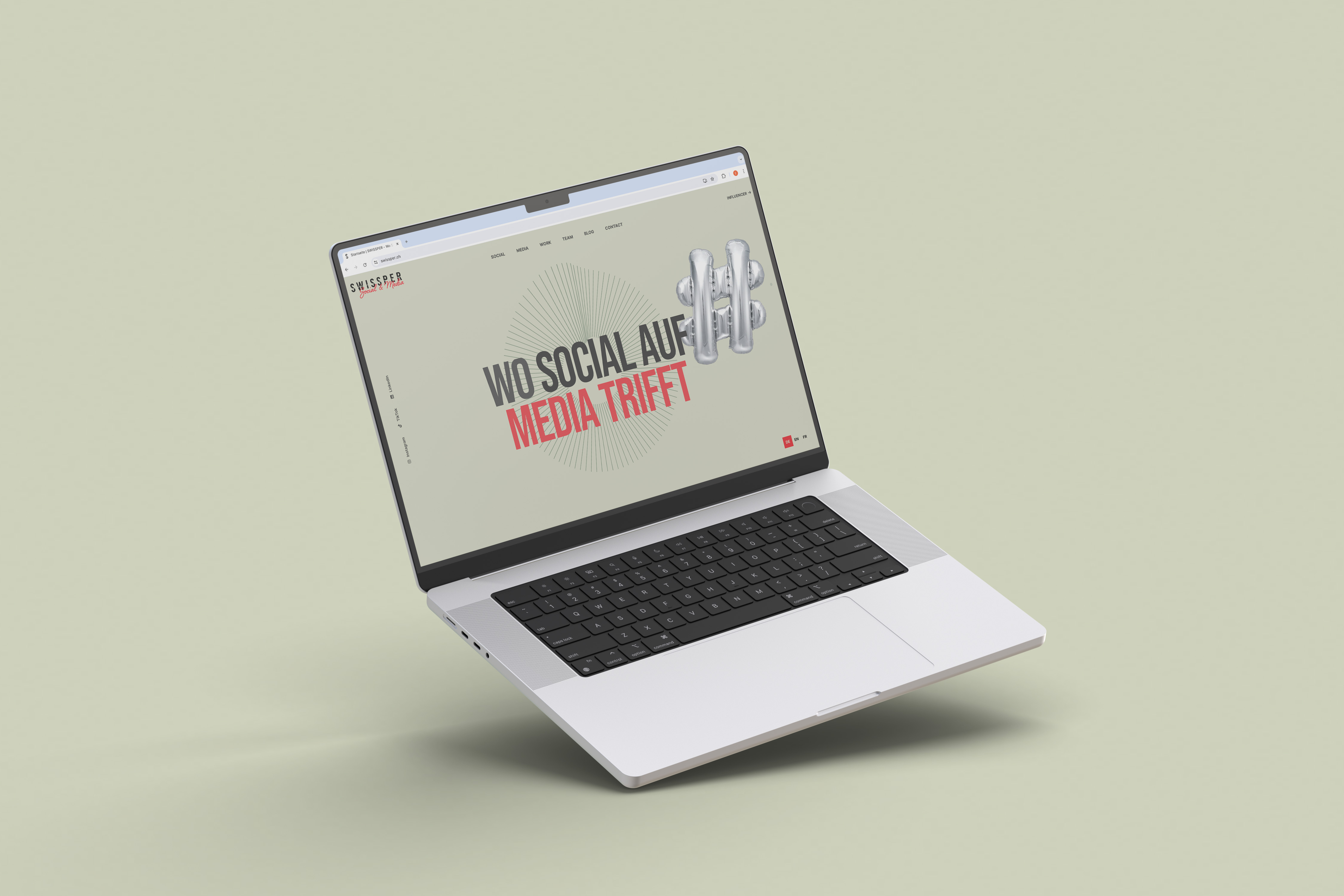
Rawcut was also involved in the digital appearance: We created the design in collaboration with WTWY. Animated service GIFs, inspired by pop art and collage techniques, reflect the young, culturally influenced energy of Zurich and bring movement to SWISSPER's communication.
