Rosca Caffè
Rebranding
Brief
Rosca Caffè wanted to evolve from its previous everyday image to a new, visually high-quality identity - with Italian soul and Swiss clarity. The goal was a rebranding that made craftsmanship, origin and quality visible.
The challenge: to develop a visual language that combines Italian passion for coffee with the precision and restraint of Swiss design.

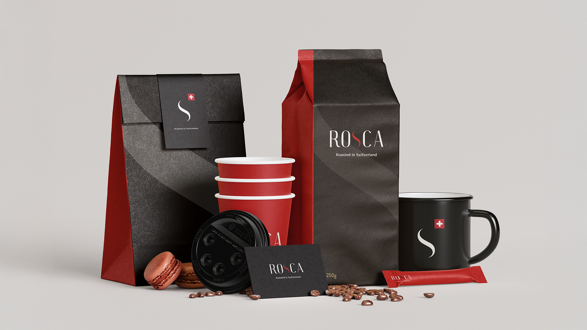
Solution
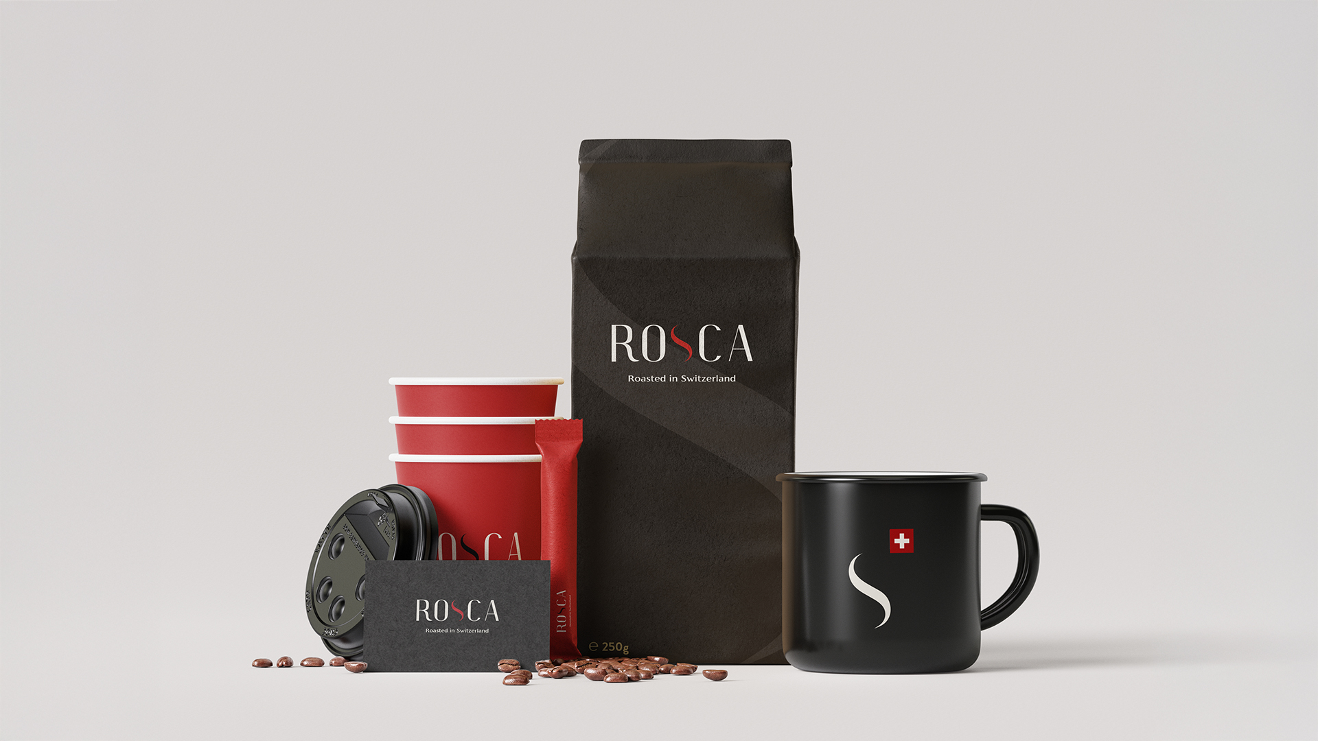
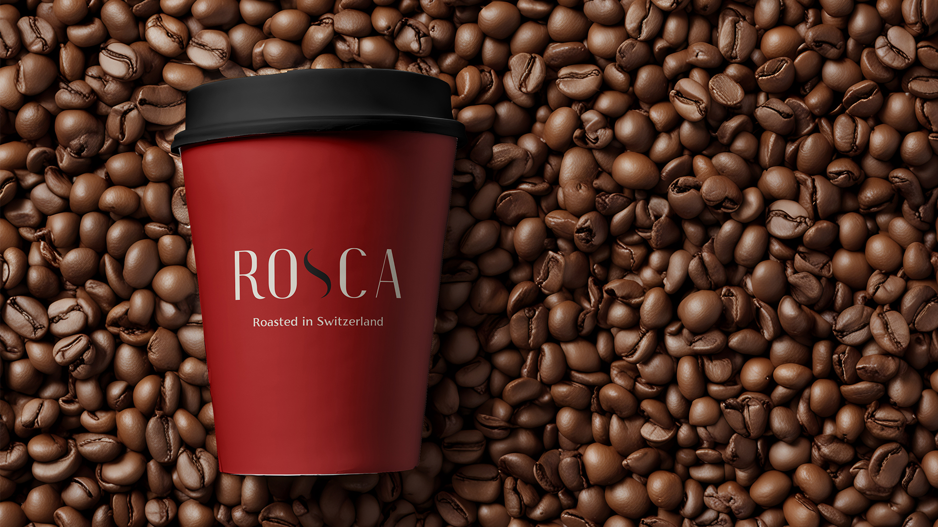
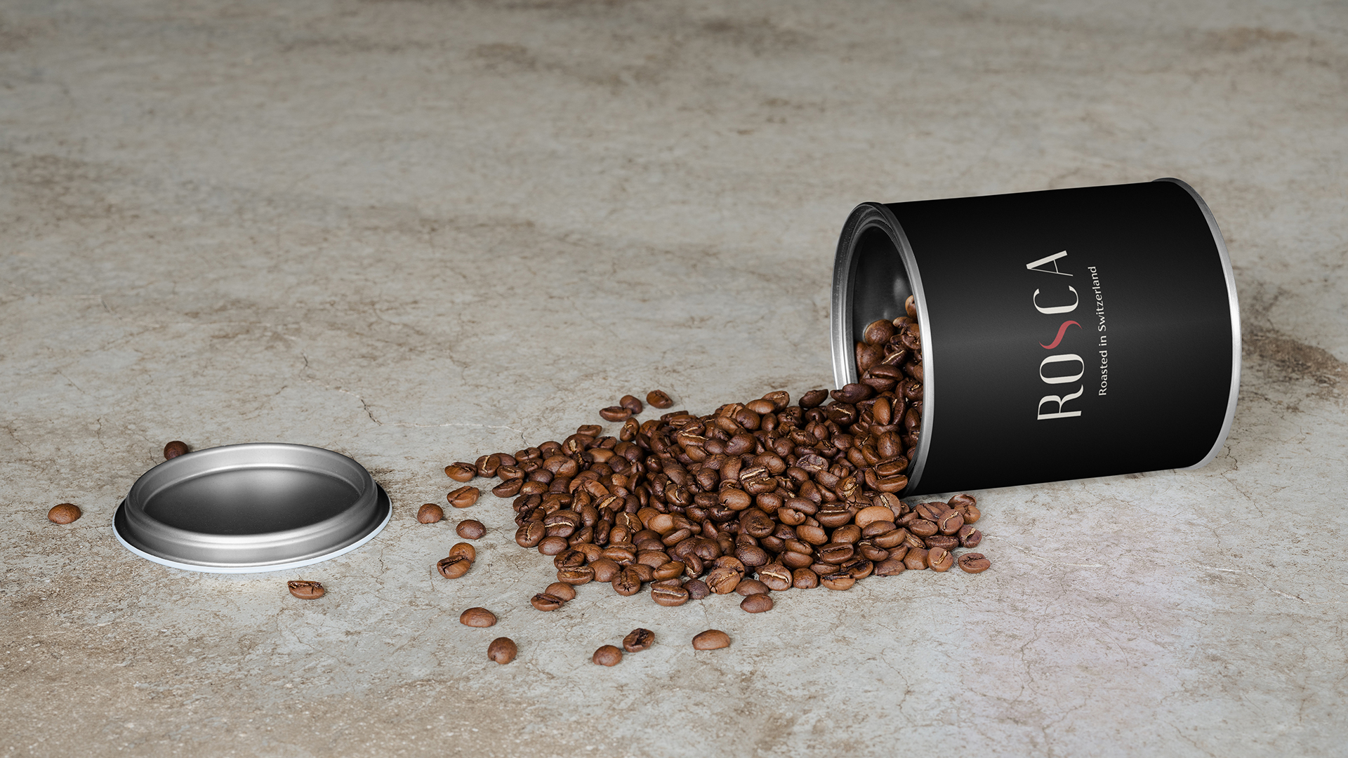
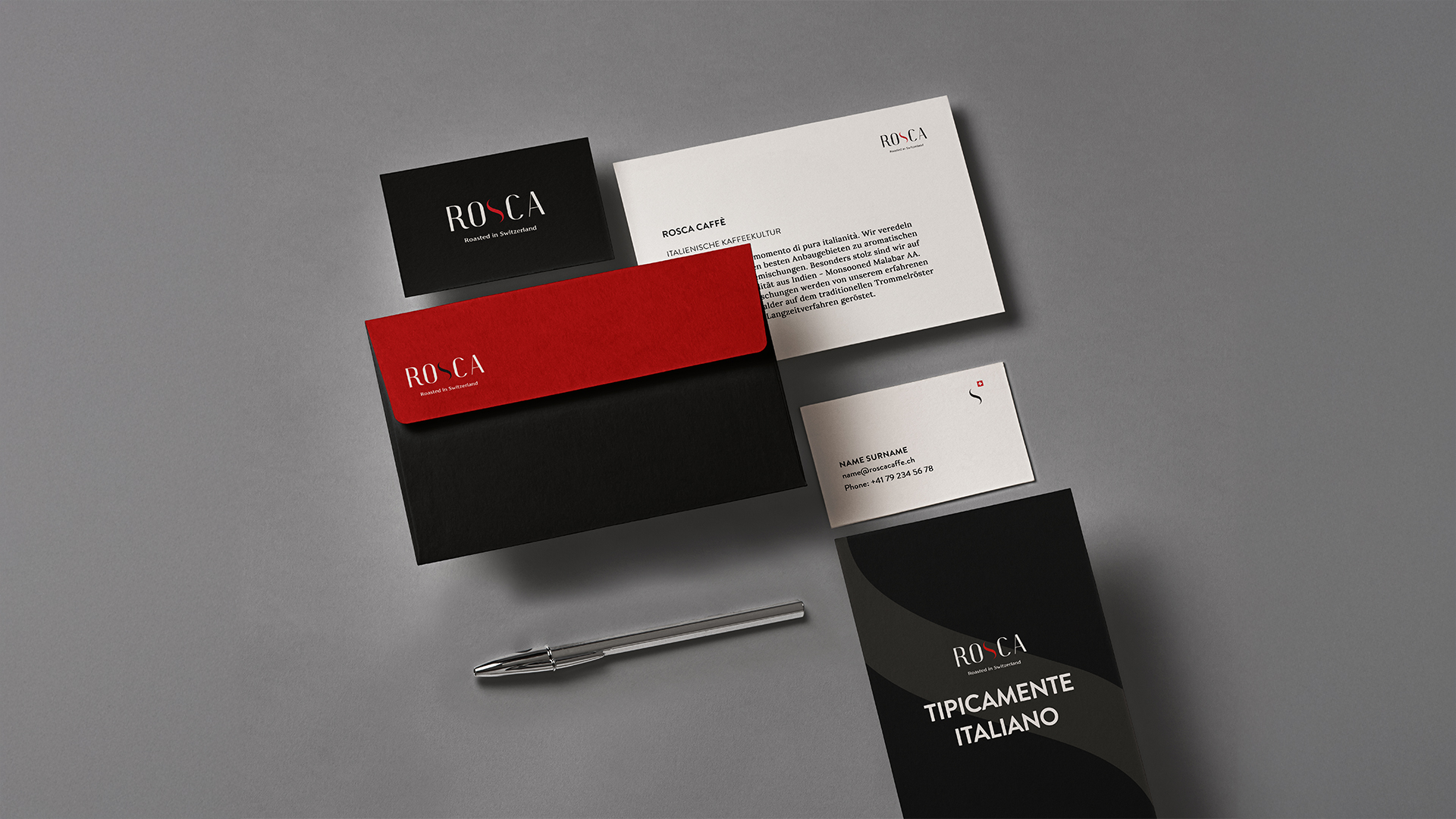
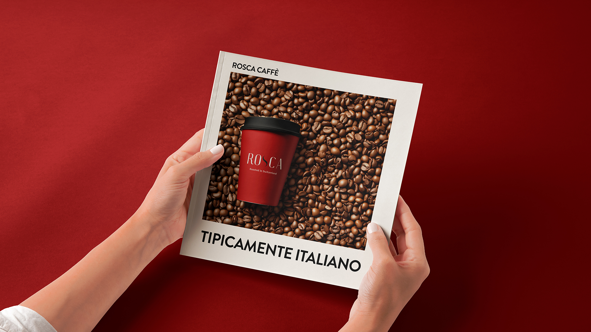
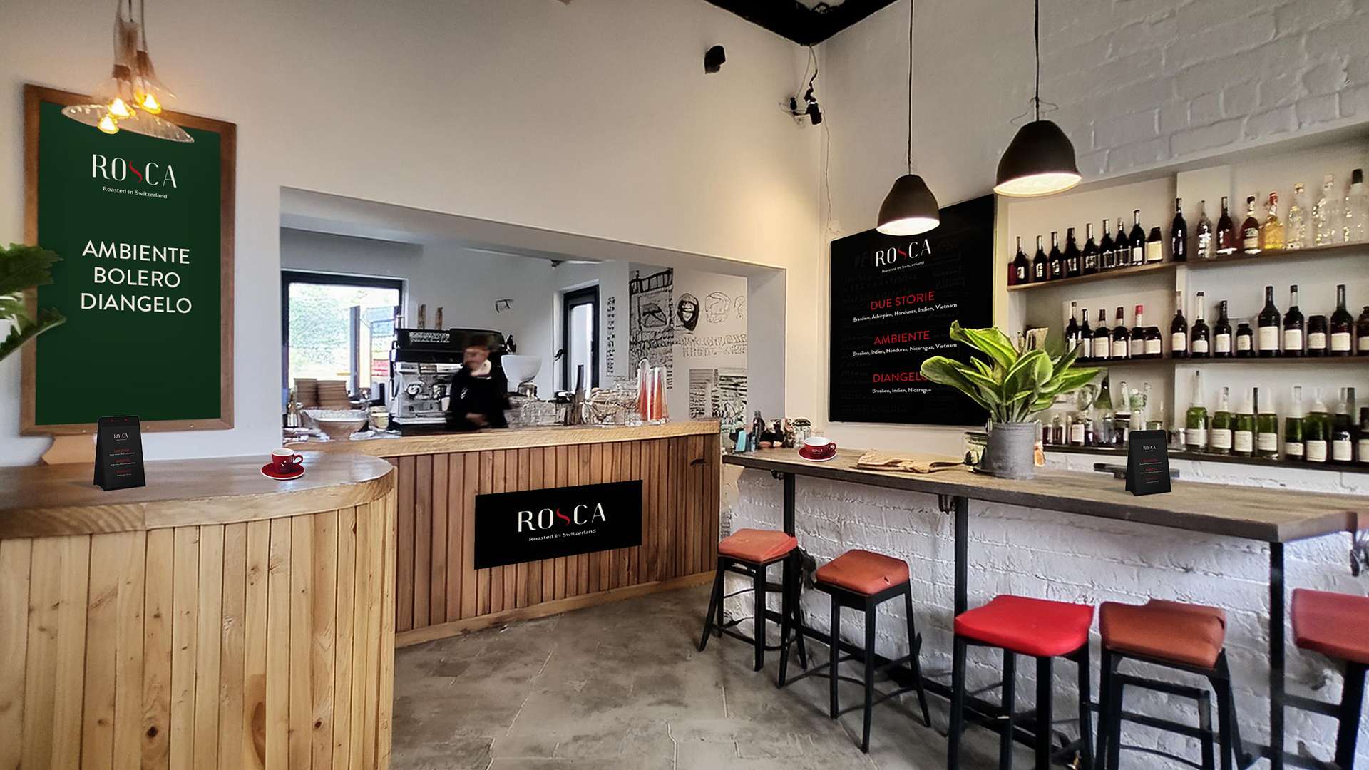
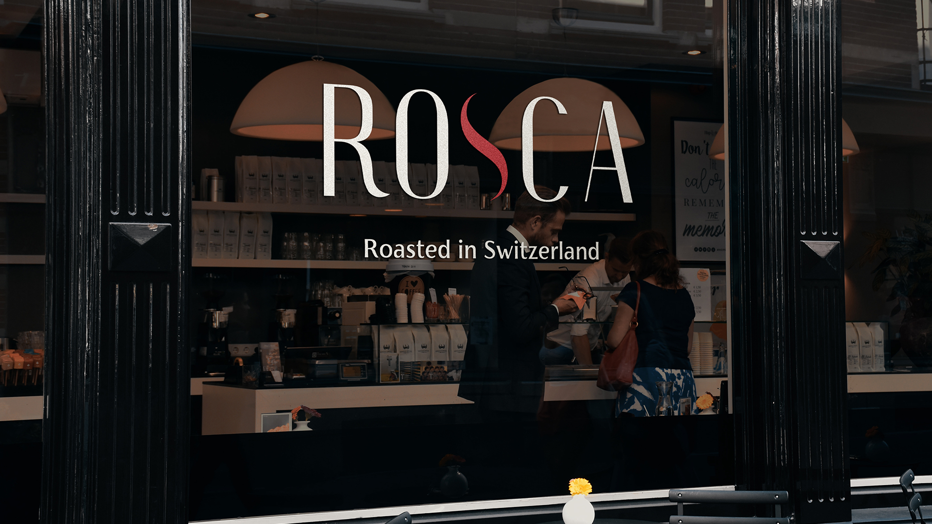
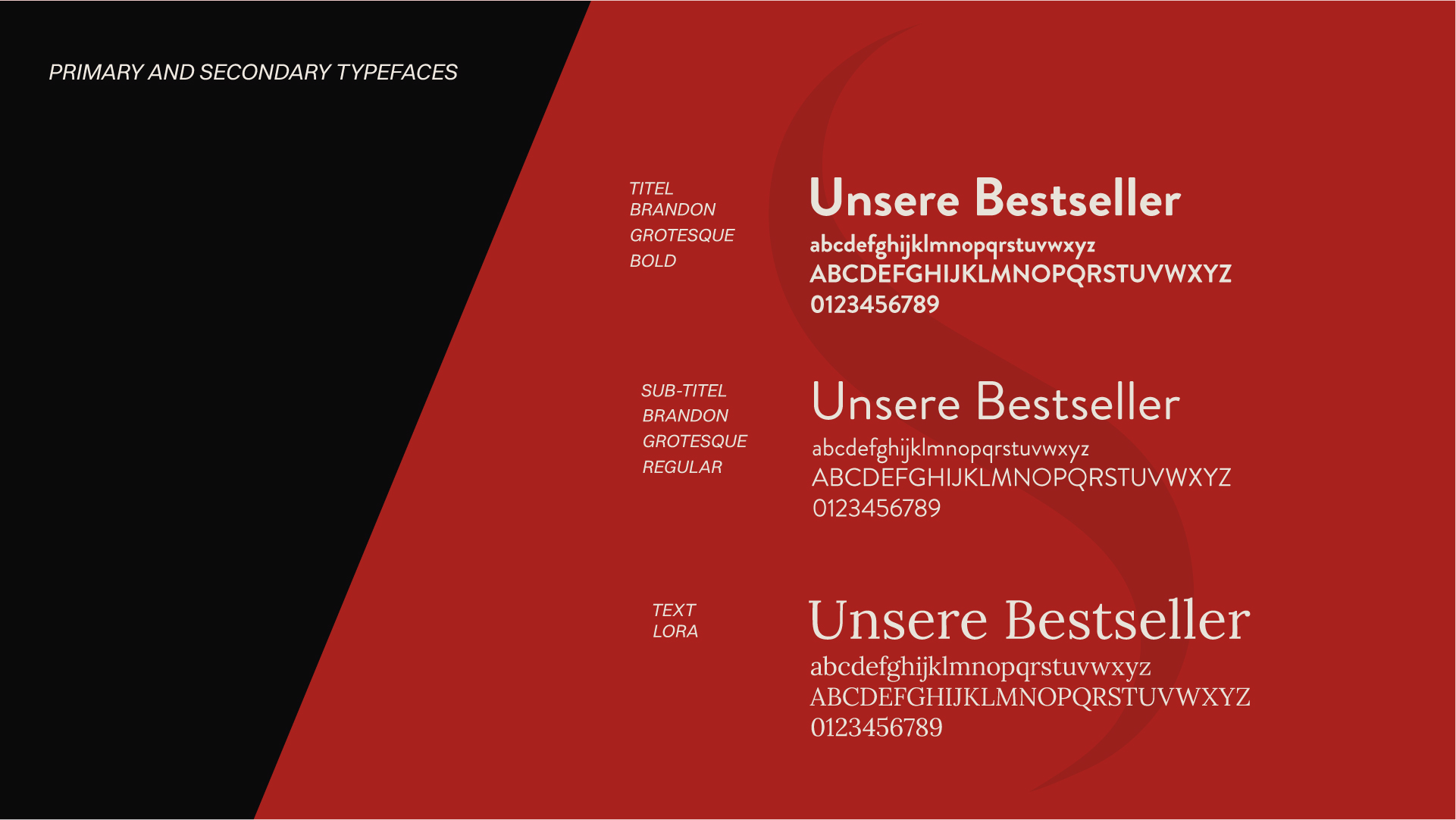
We developed a new logo and a consistent CI/CD system that underlines Rosca's premium claim. The central design element is an abstract “S” - inspired by the original logo and reinterpreted as a stylized coffee team. The new color scheme combines deep black with cream and a strong red - a reminiscence of the Swiss cross and at the same time a reference to Italian warmth. The typography combines clear structure with fine details and gives the brand a modern, calm character.
The result: a visual identity that positions Rosca as a distinctive coffee brand - with origin, attitude and character.