Merkur
Rebranding
Brief
Merkur Kaffee, one of Switzerland's most traditional coffee brands, wanted to revamp its visual identity. The aim was to position the brand as a modern classic: The new rebranding was to build a bridge between the old Merkur logo and the previous rebranded version. The result was a reduced, clearer design language that meets today's requirements in terms of design and brand impact.
Merkur Kaffee, one of Switzerland's most traditional coffee brands, wanted to revamp its visual identity. The aim was to position the brand as a modern classic: The new rebranding was to build a bridge between the old Merkur logo and the previous rebranded version. The result was a reduced, clearer design language that meets today's requirements in terms of design and brand impact.
Solution
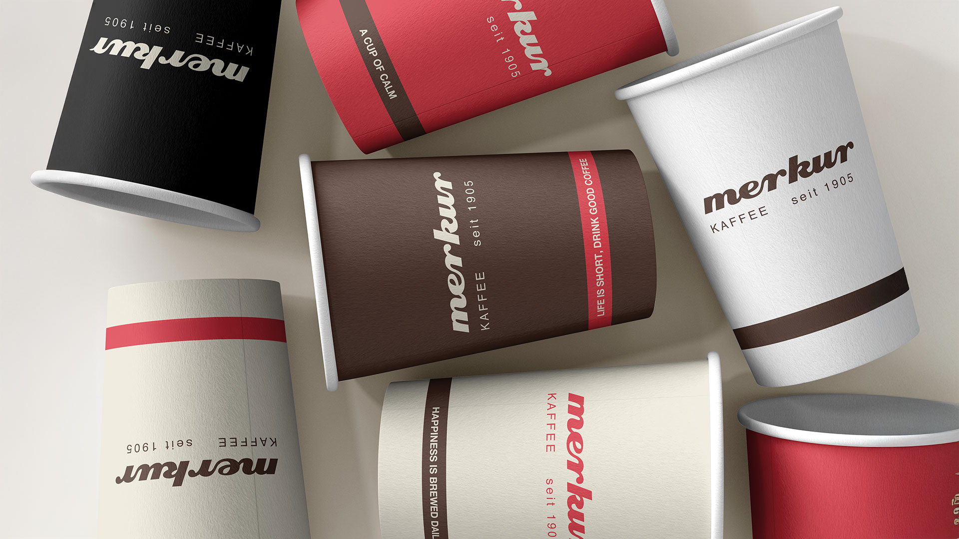
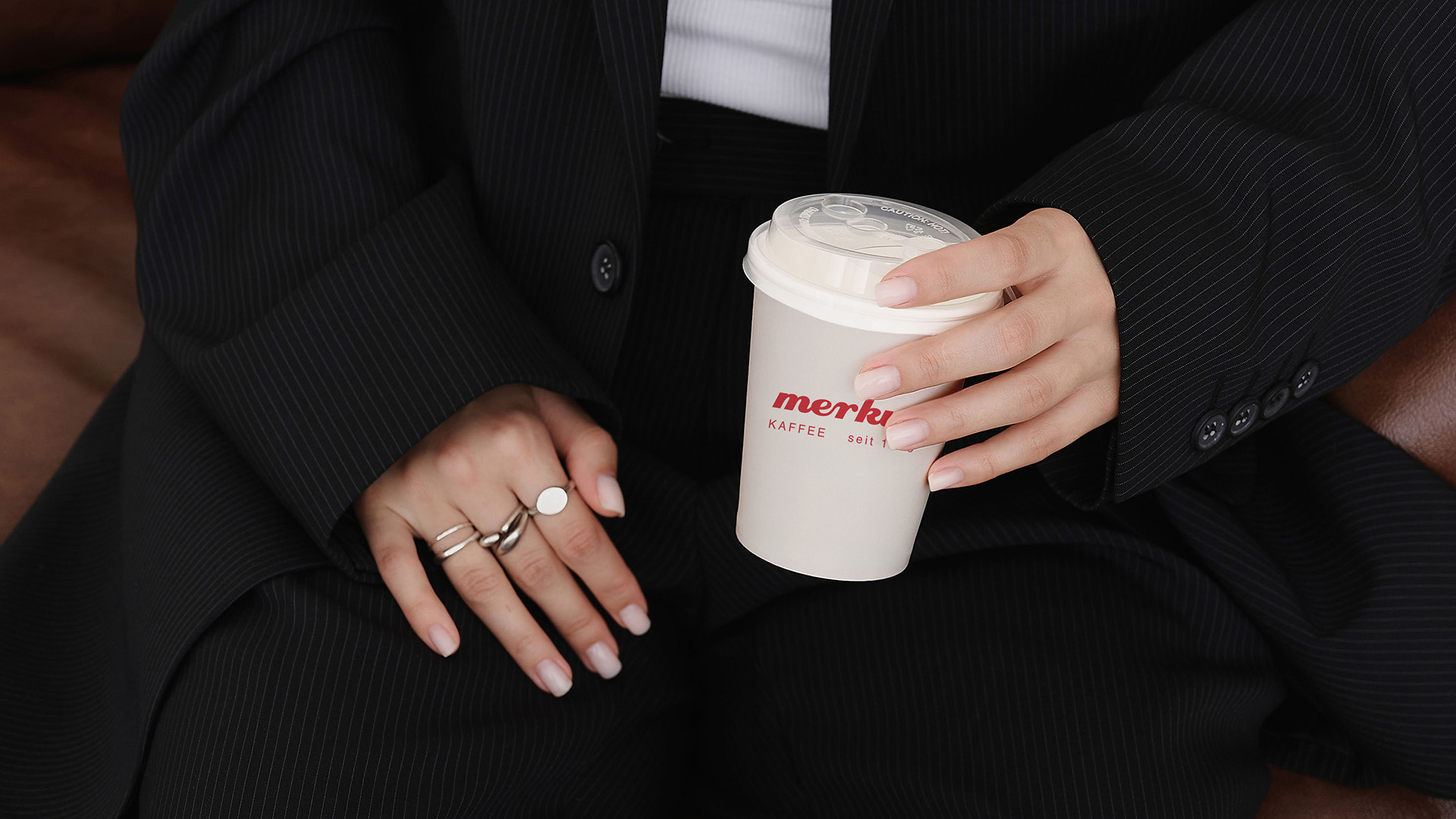
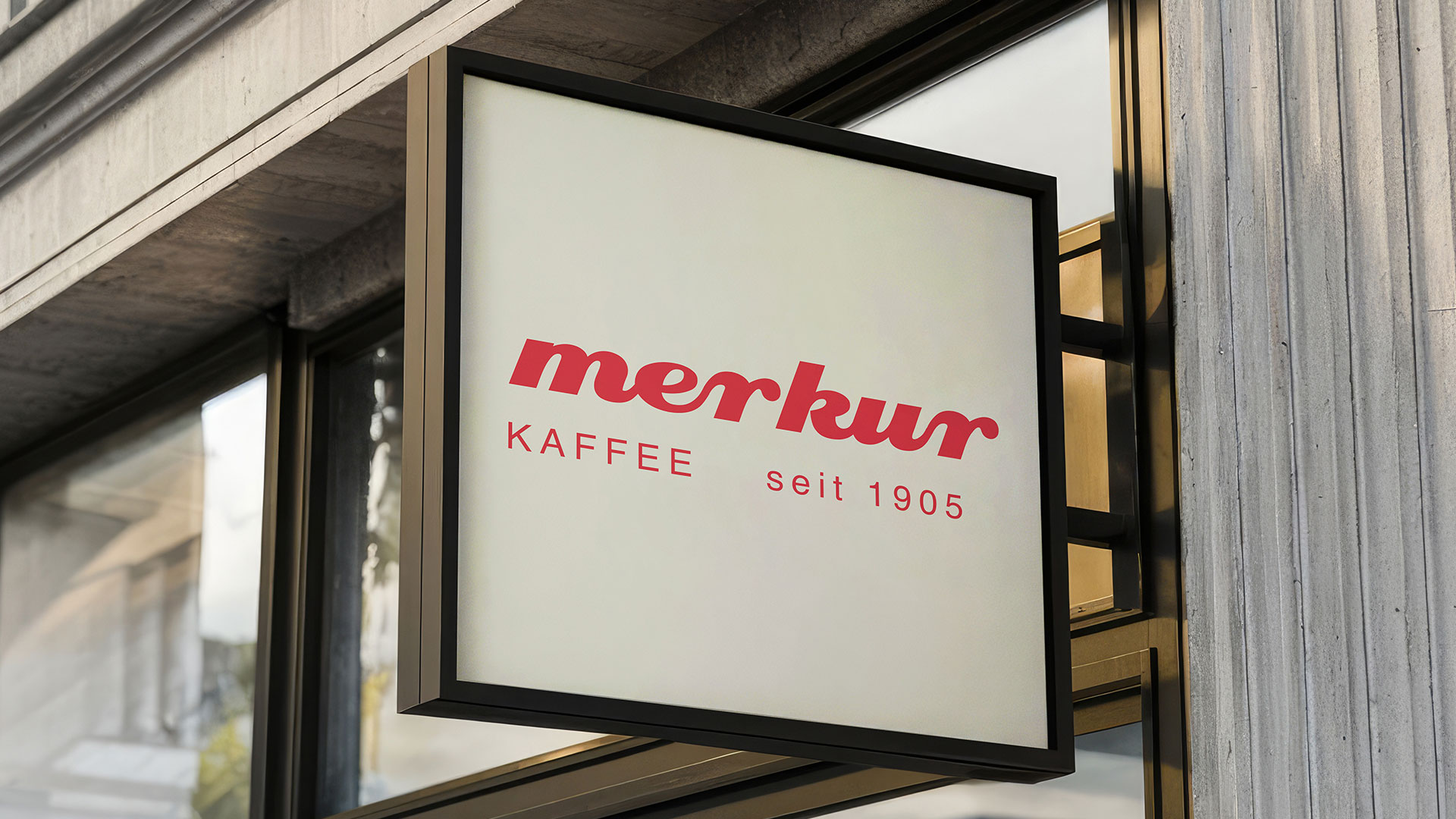
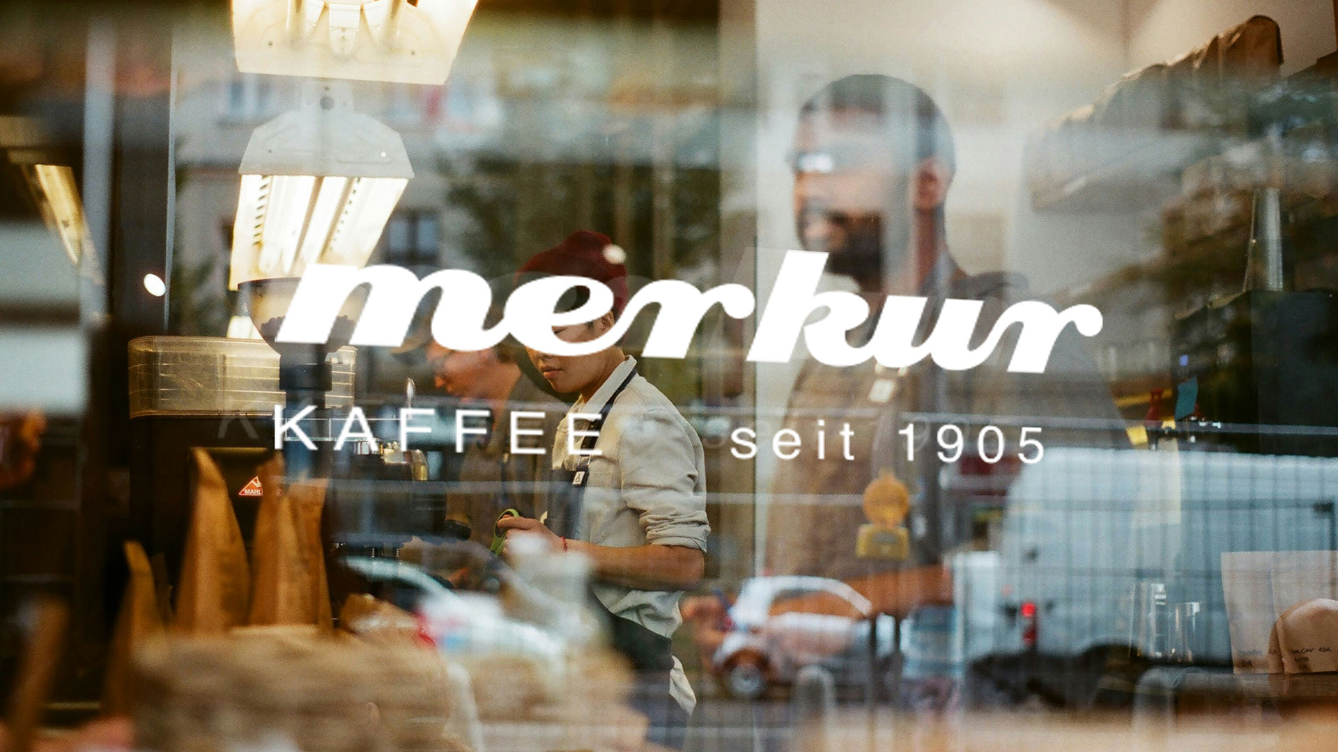
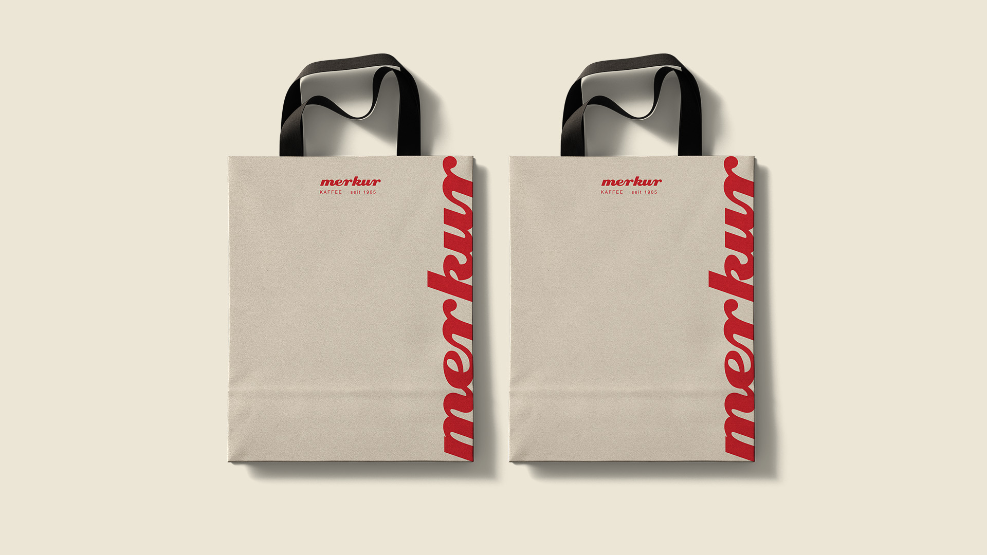
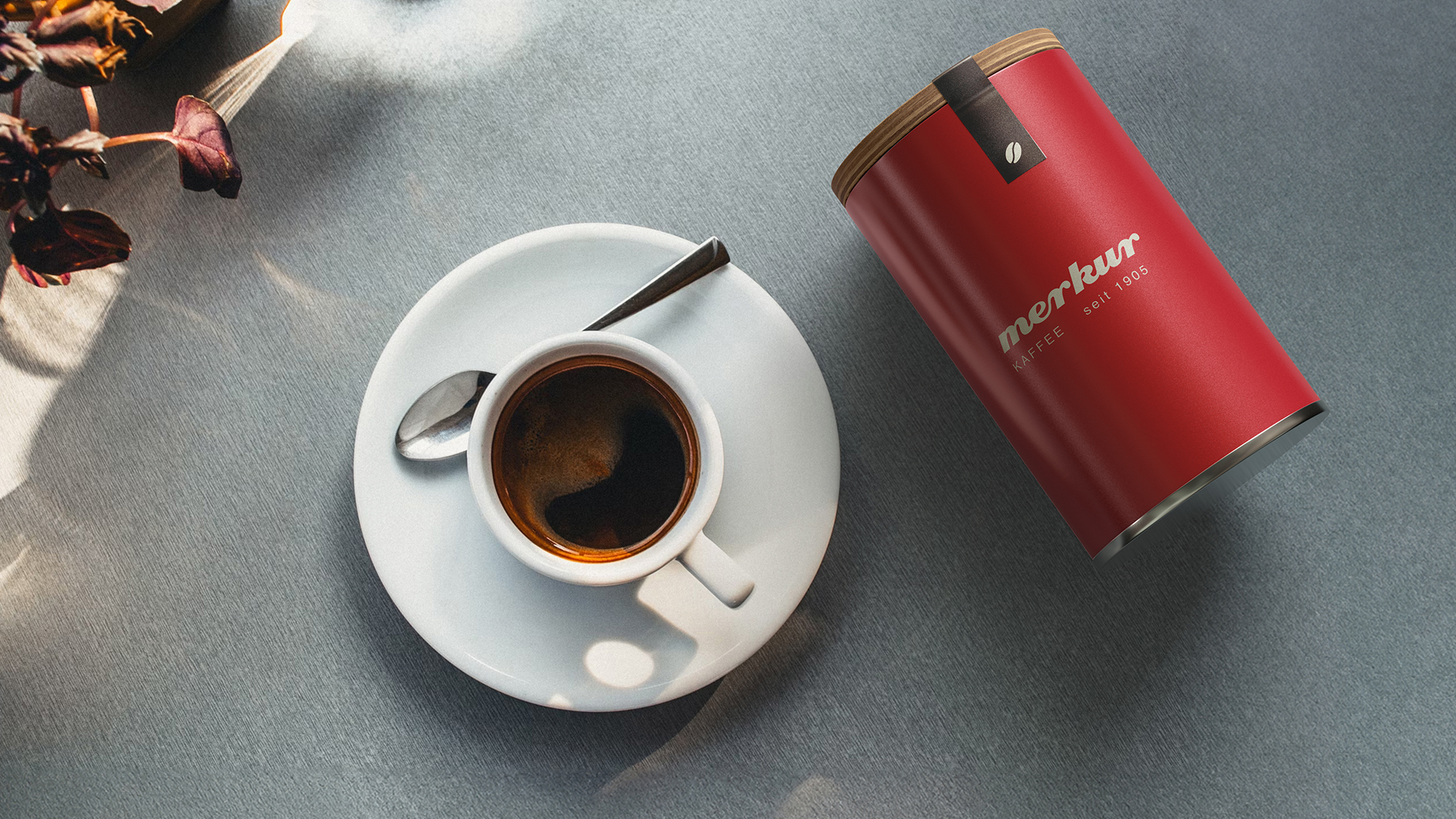
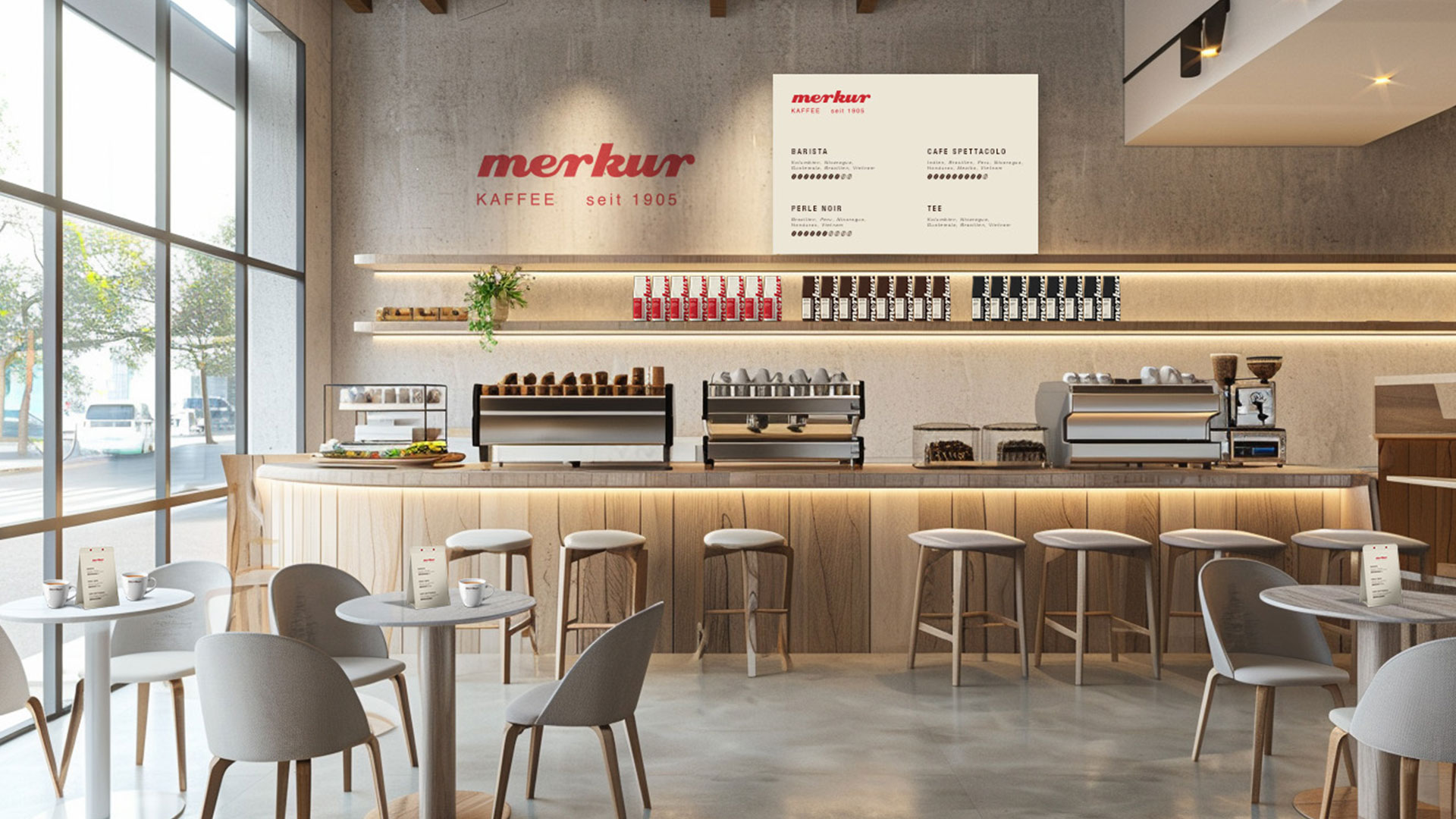
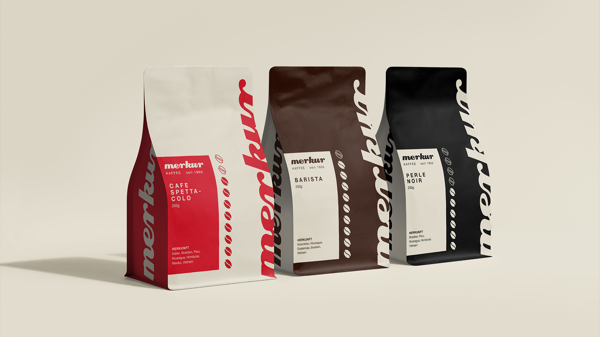
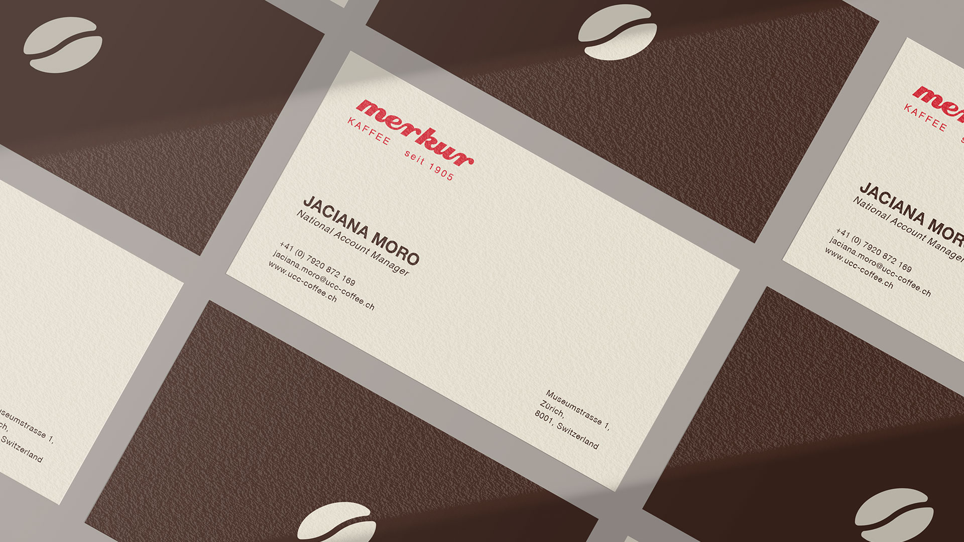
We developed a new logo that combines elements of the old and last Merkur logos. The shape of the typography - inspired by the pouring of coffee - brings dynamism and elegance to the appearance. The new byline emphasizes the long tradition since 1905 and is supported by the targeted use of Helvetica Neue - a typographic Swiss classic.
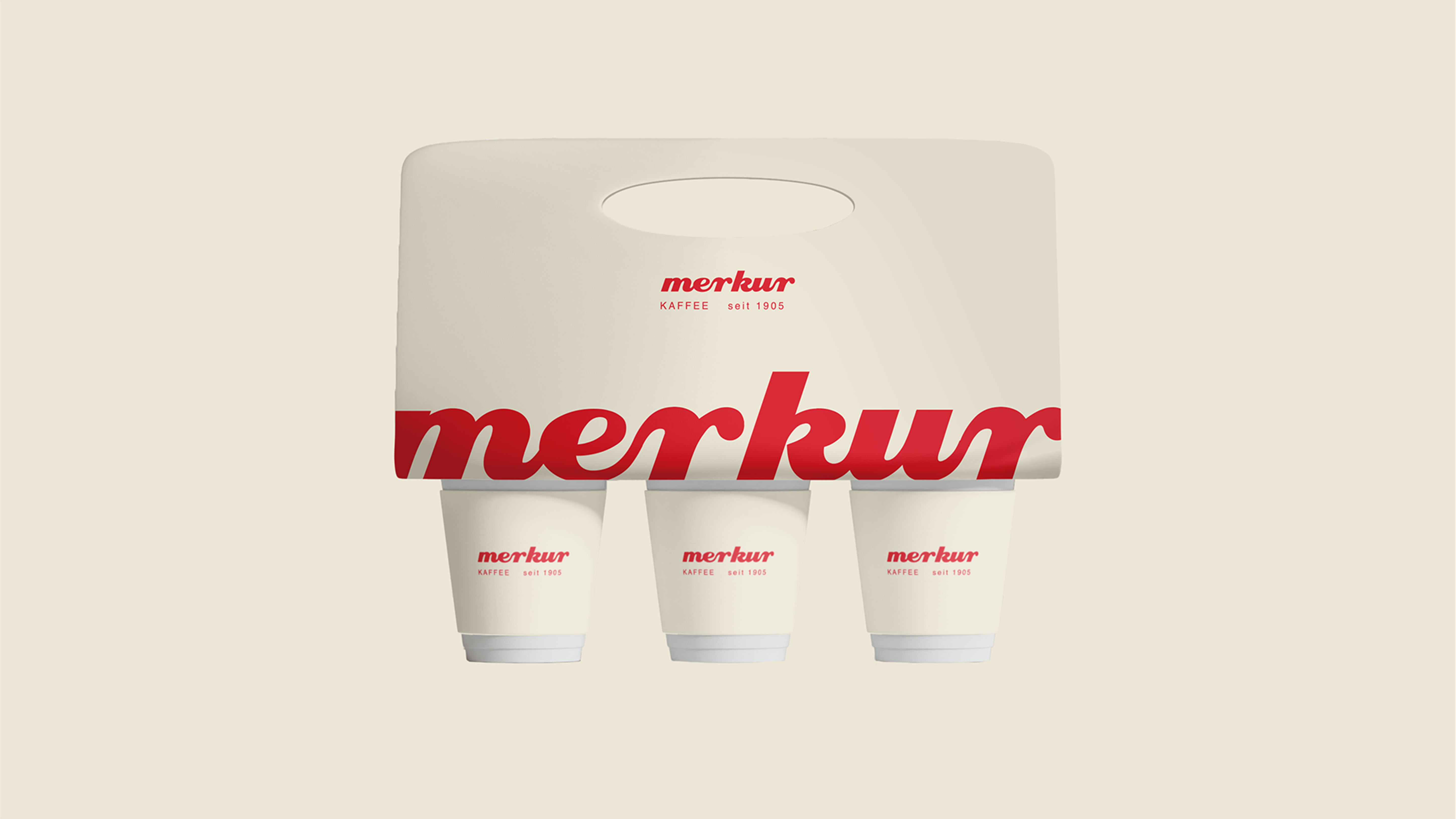
The color scheme has been taken back to its origins: A strong, modernized red meets a warm cream. This combination looks classic and contemporary at the same time. On the packaging, we opted for minimalism instead of photography. Graphic coffee bean icons illustrate the strength of the coffee at a glance. The new design combines Swiss coffee culture with modern clarity.
We developed a new logo that combines elements of the old and last Merkur logos. The shape of the typography - inspired by the pouring of coffee - brings dynamism and elegance to the appearance. The new byline emphasizes the long tradition since 1905 and is supported by the targeted use of Helvetica Neue - a typographic Swiss classic.
The color scheme has been taken back to its origins: A strong, modernized red meets a warm cream. This combination looks classic and contemporary at the same time. On the packaging, we opted for minimalism instead of photography. Graphic coffee bean icons illustrate the strength of the coffee at a glance. The new design combines Swiss coffee culture with modern clarity.