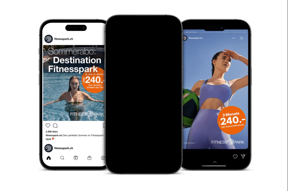
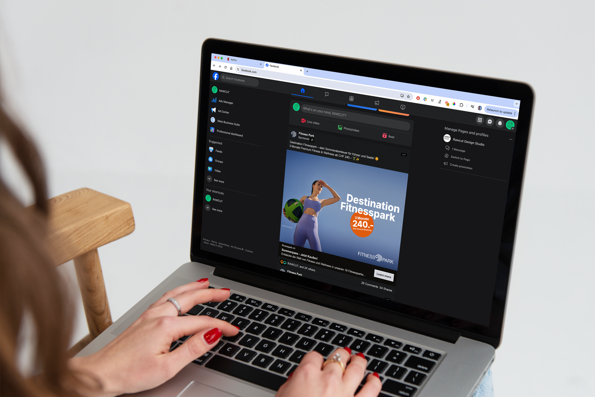
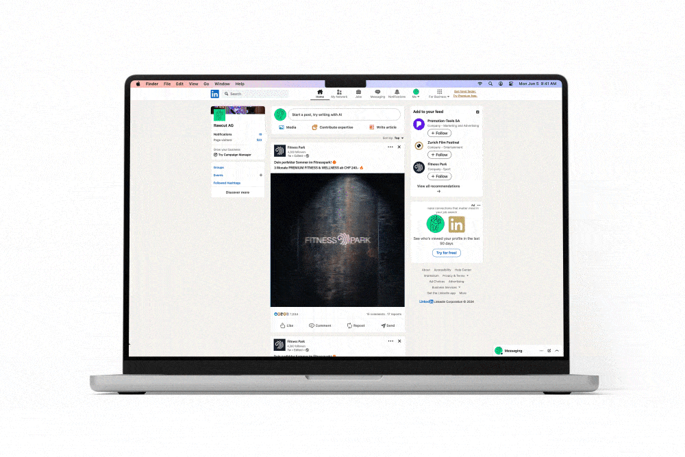
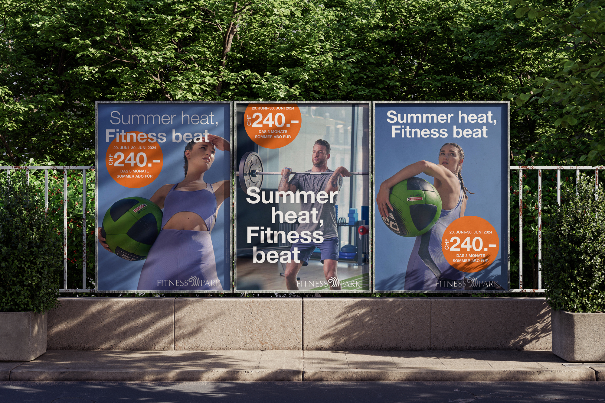
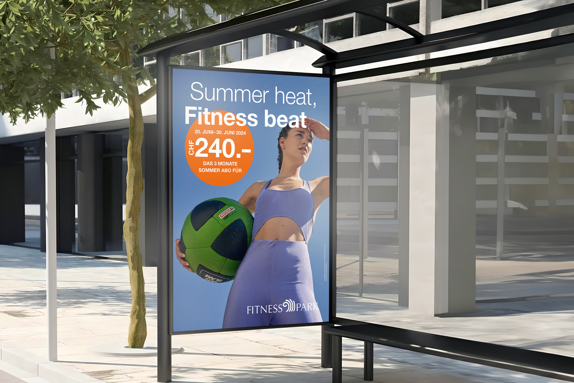
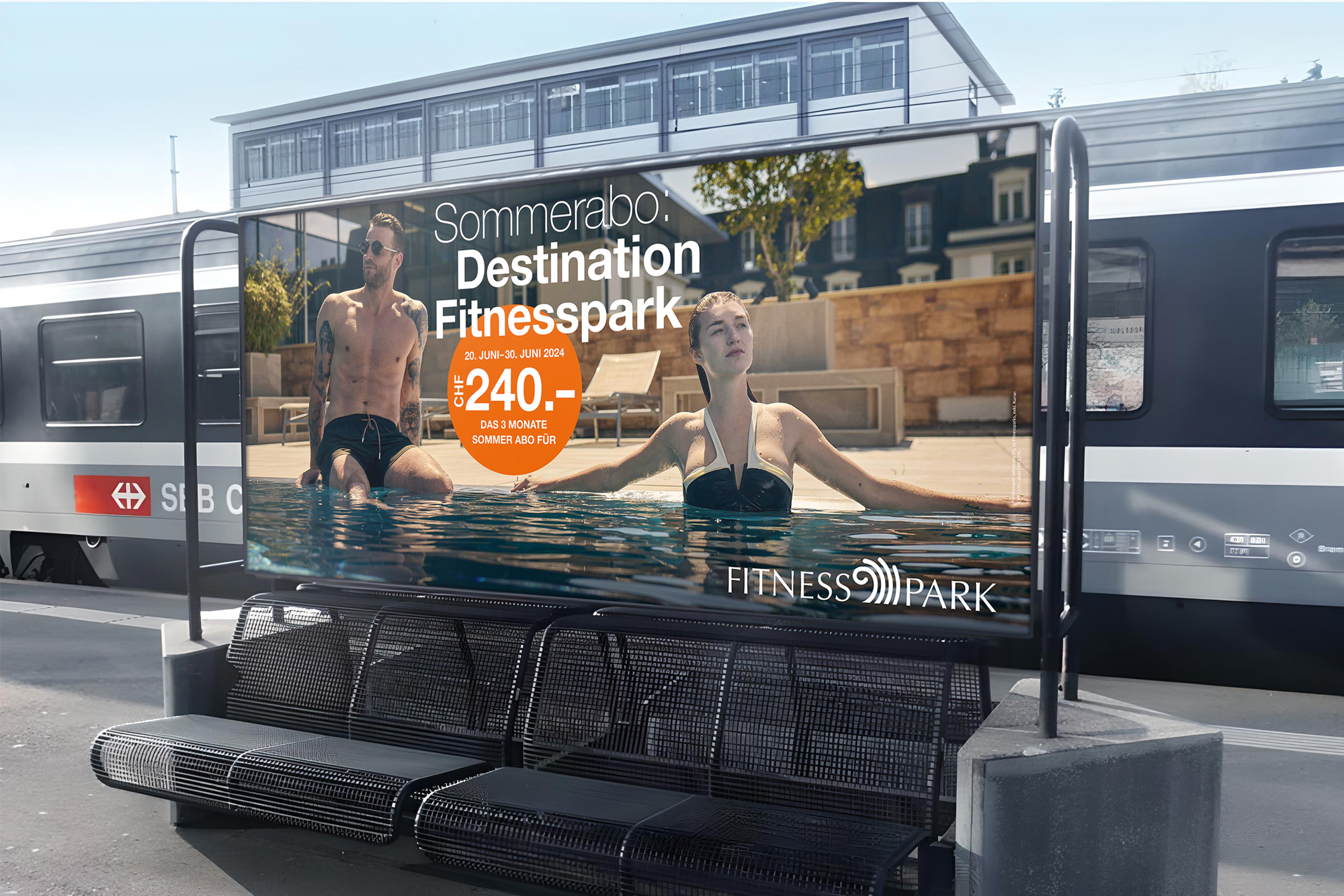
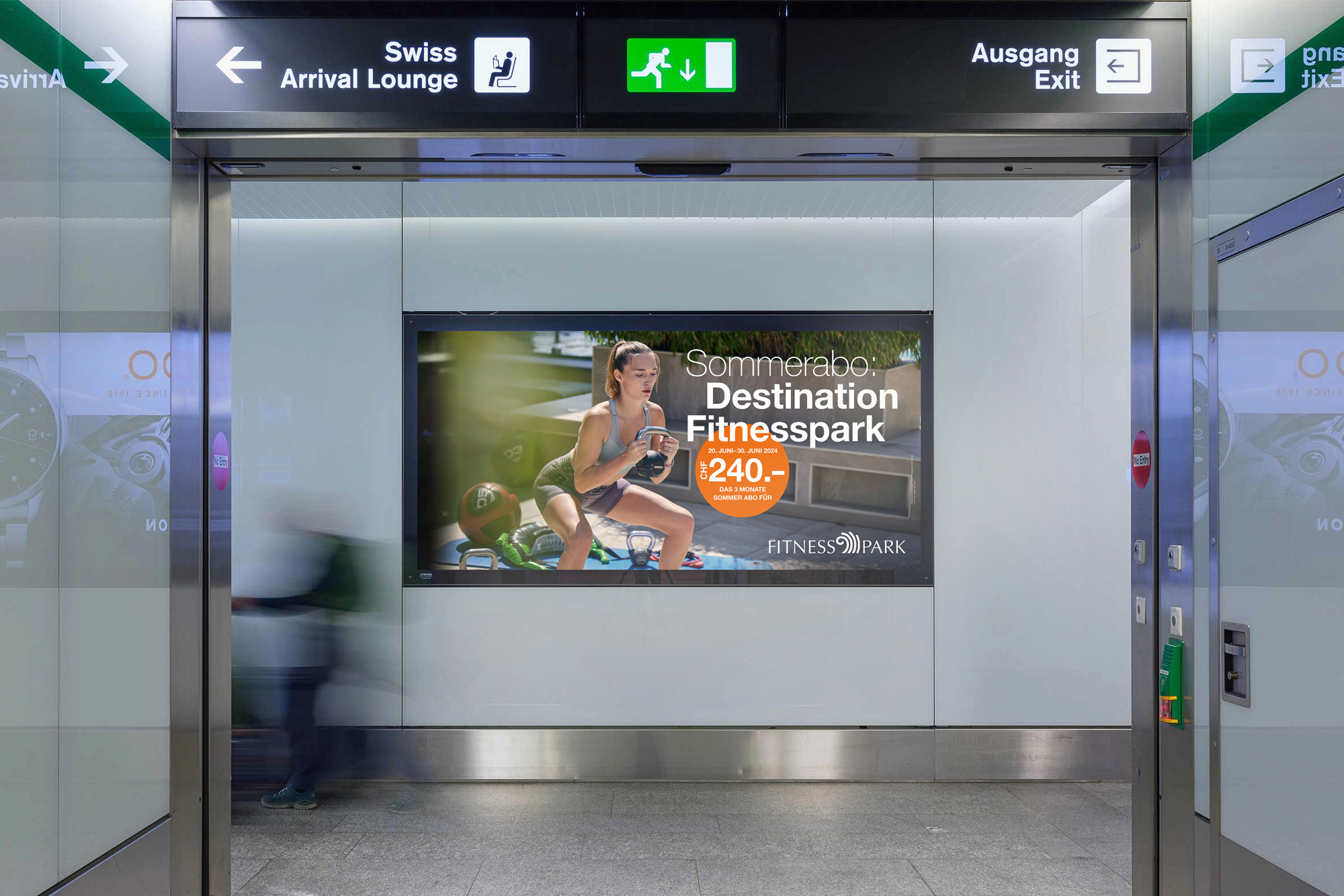
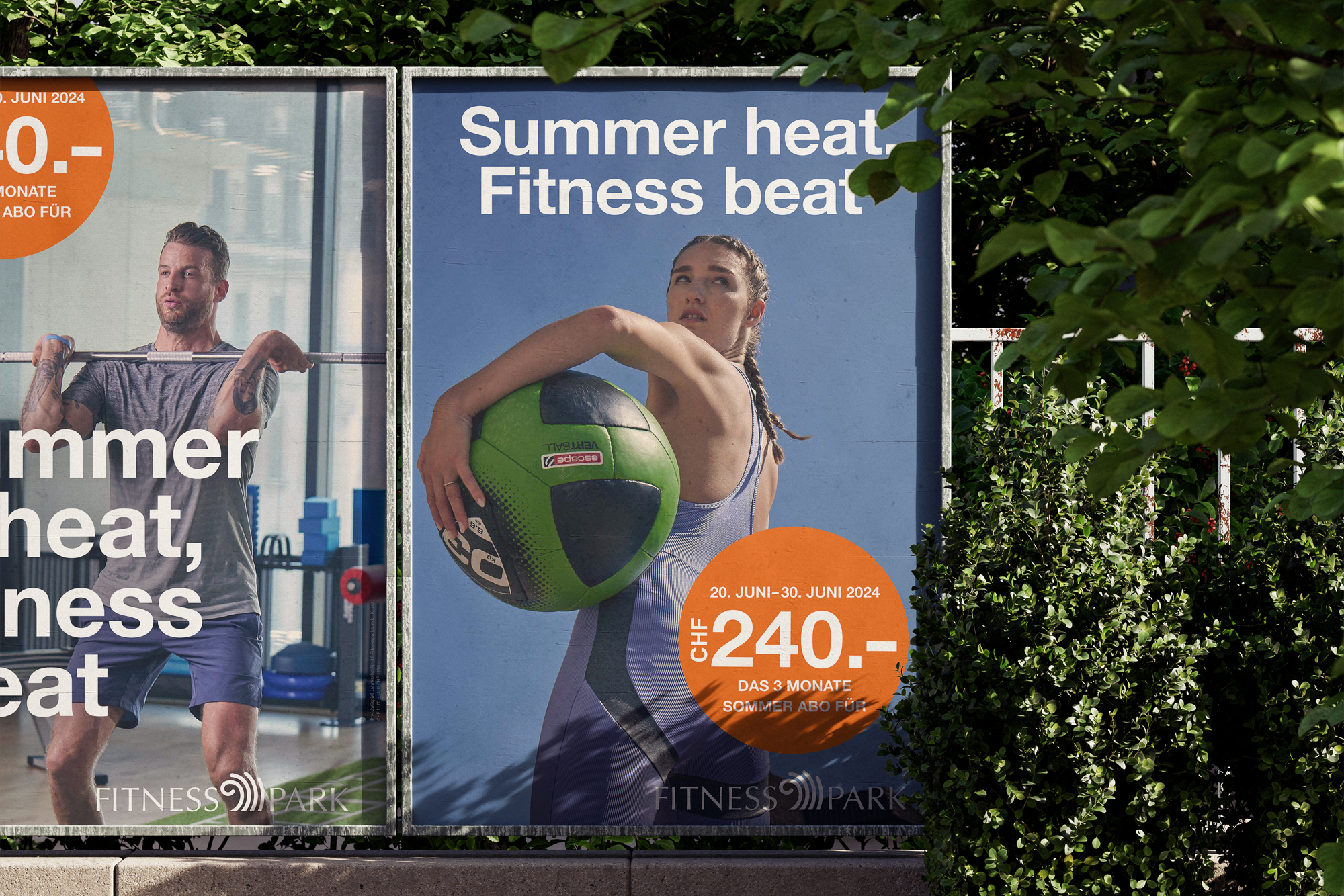
Advertising Campaign
Fitnesspark didn’t just need new visuals – it needed a new feeling. After years of strong market presence, the time had come to elevate the brand’s visual identity to match its growing sense of quality - visually, tonally, and emotionally.
The previous imagery no longer captured the brand’s ambition. It lacked the clarity and presence needed to communicate exclusivity in a saturated market. The goal was not to reinvent, but to refine: to translate the brand’s quality into a coherent, cinematic language that would resonate with both loyal members and new audiences.
The challenge: to create a visual world that reflects sophistication without distance, strength without noise, and wellness as a state of mind - designed for those who expect more.
Solution
We developed a premium visual language that translated the brand’s values into atmosphere and tone. At its core stood a refined color palette - built to evoke calm, strength, and exclusivity - serving as the foundation for model styling, set direction, and overall mood.
Creative direction was rooted in research and subtle symbolism. Inspired by the world of James Bond, we introduced cinematic elegance: sophistication with a touch of intrigue. Our expertise in color theory enabled the creation of a consistent visual experience, enhancing brand recognition while inviting a broader audience.
The result: a new aesthetic that resonates with both existing and future members. Clearer. Bolder. Sharper. A brand identity not just refreshed - but redefined.